An institution that argues back.
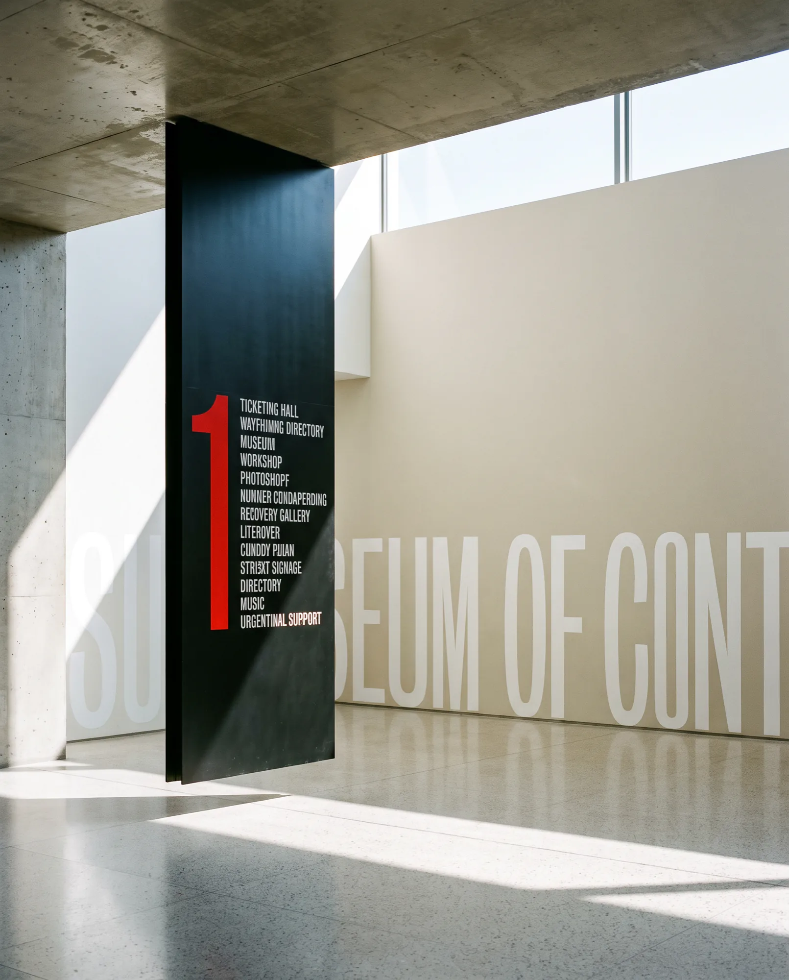
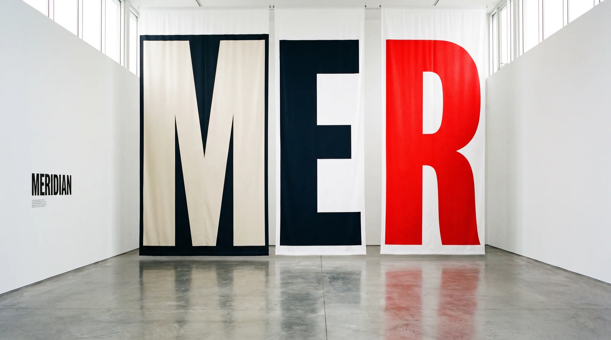
A civic museum that had gone quiet. One typographic system, scaled from a ticket to a nine metre banner, gave the programme a voice loud enough to be heard from the road.
CONCU builds identities that carry weight from the first pitch to the tenth year. Strategy, design and the software that carries them.
We start at the argument: what a company is actually for, and why anyone outside it should care. Everything after that is craft in service of the answer. Naming, identity, creative direction, and the websites, products and apps where most people will actually meet the brand.
Conceived, not decorated.
It started as an argument about what the company was for. The design is the consequence, not the brief. The rest of the archive is below.
A civic museum that had gone quiet. One typographic system, scaled from a ticket to a nine metre banner, gave the programme a voice loud enough to be heard from the road.
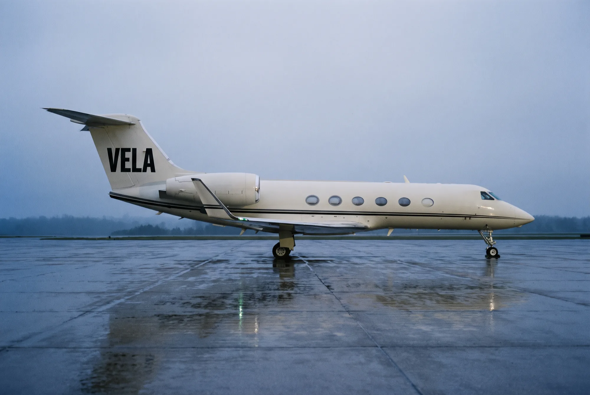
An identity with the restraint of an instrument panel and the confidence of a flag.
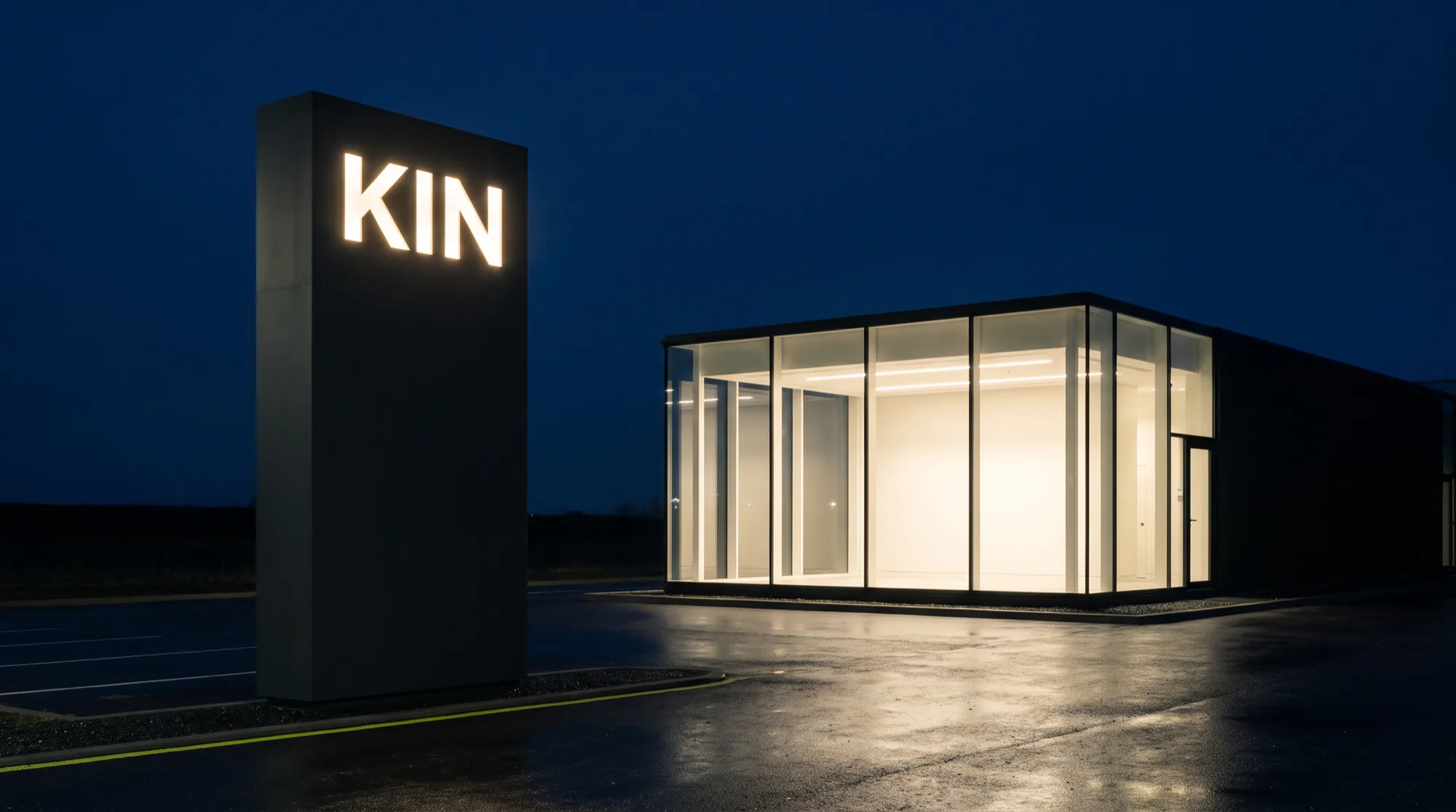
Taking the volume out of the design and putting it into the stance.
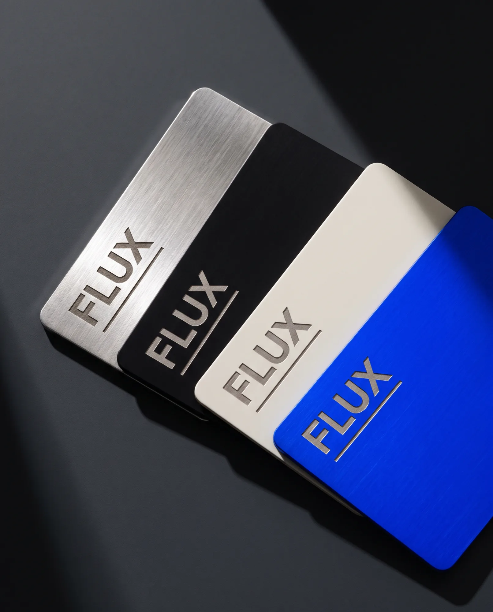
Removing every gesture toward wealth and letting the material do the talking.
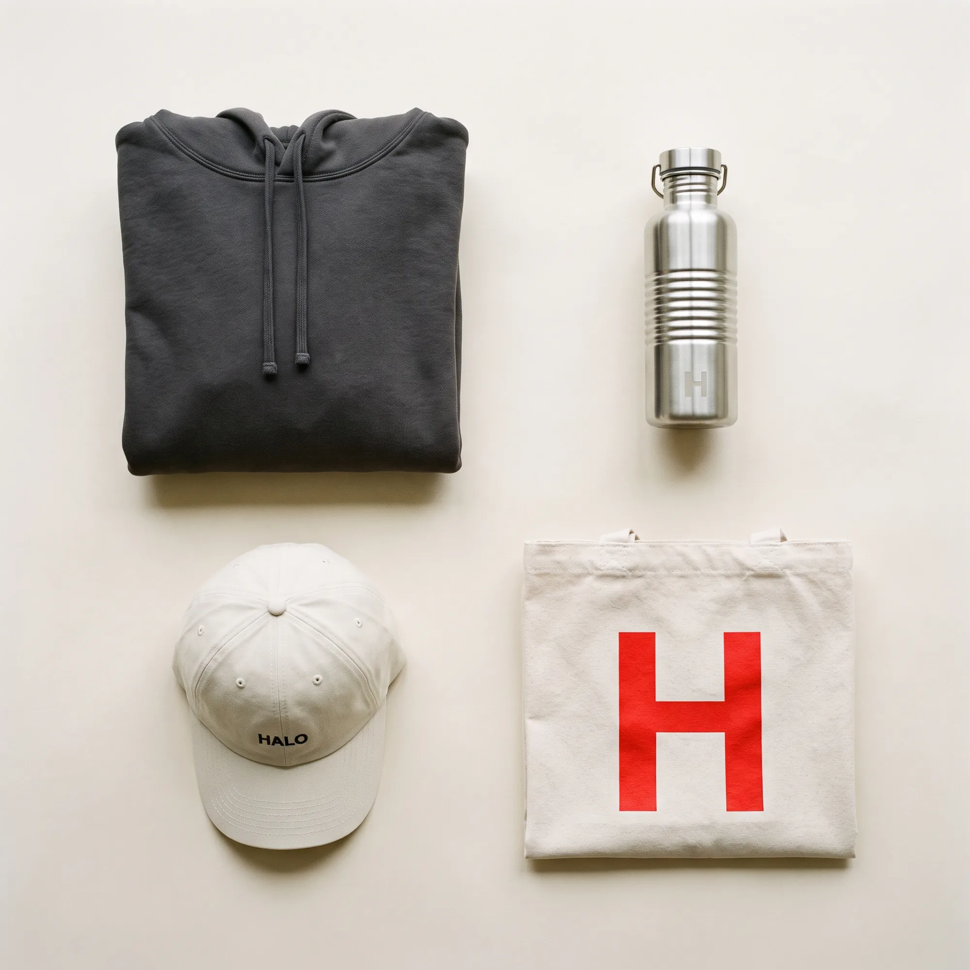
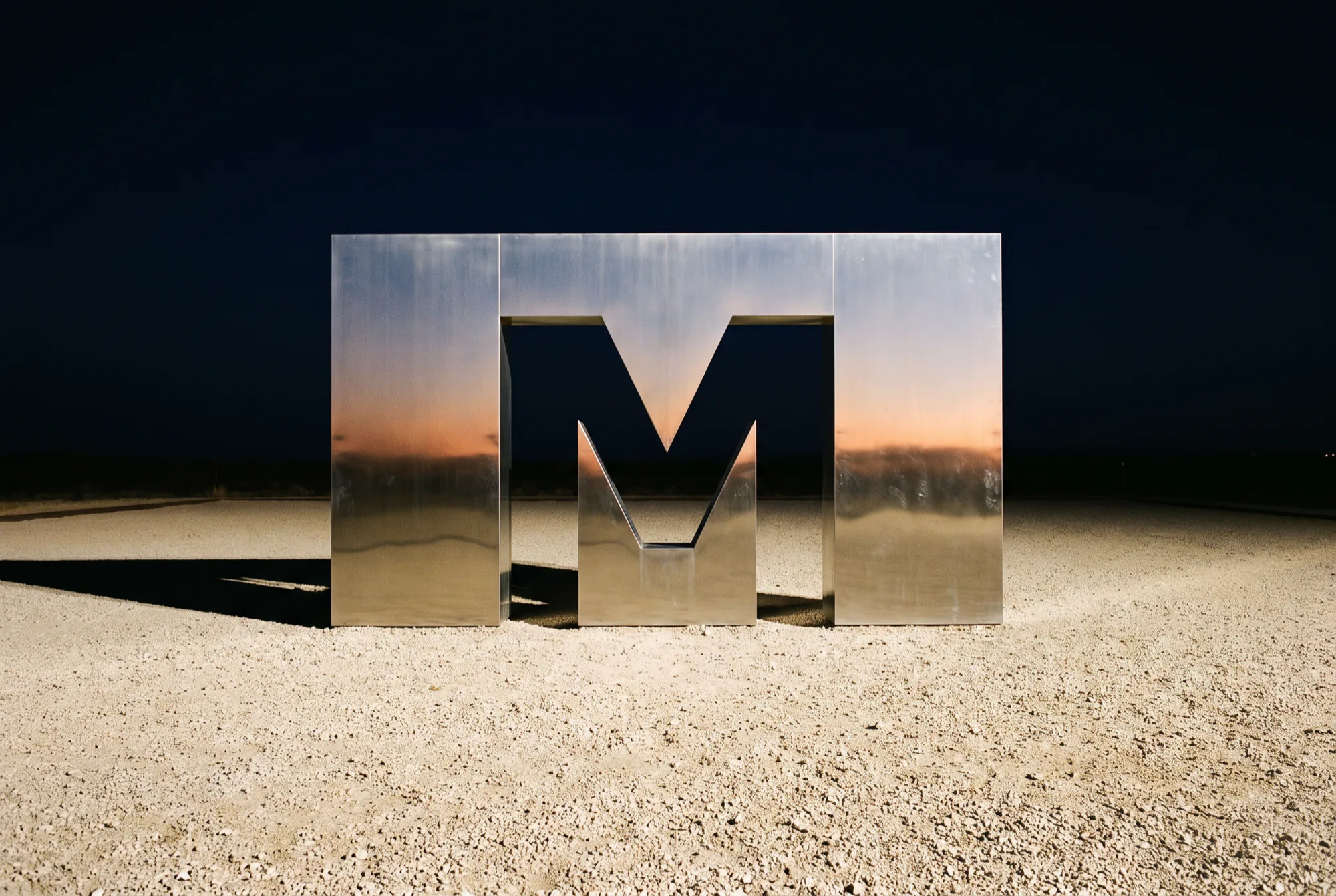
One cropped letterform, used at every scale from a cap to a delivery fleet.
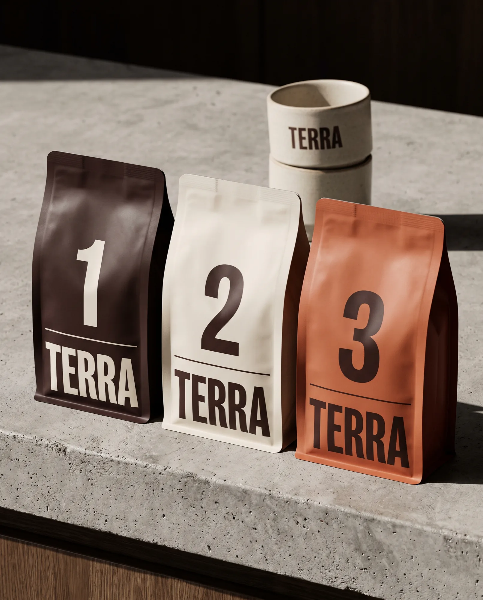
Replacing the illustration with information, set at a size you can read from a metre away.
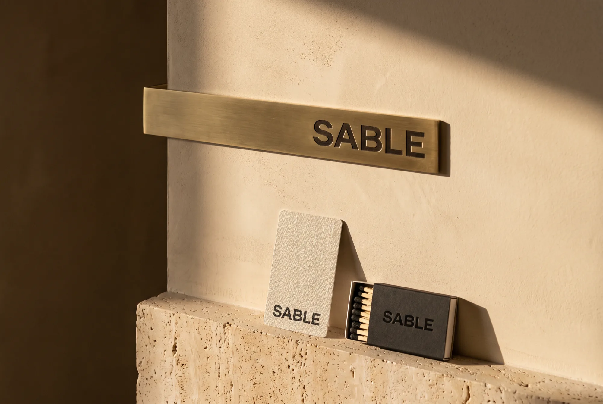
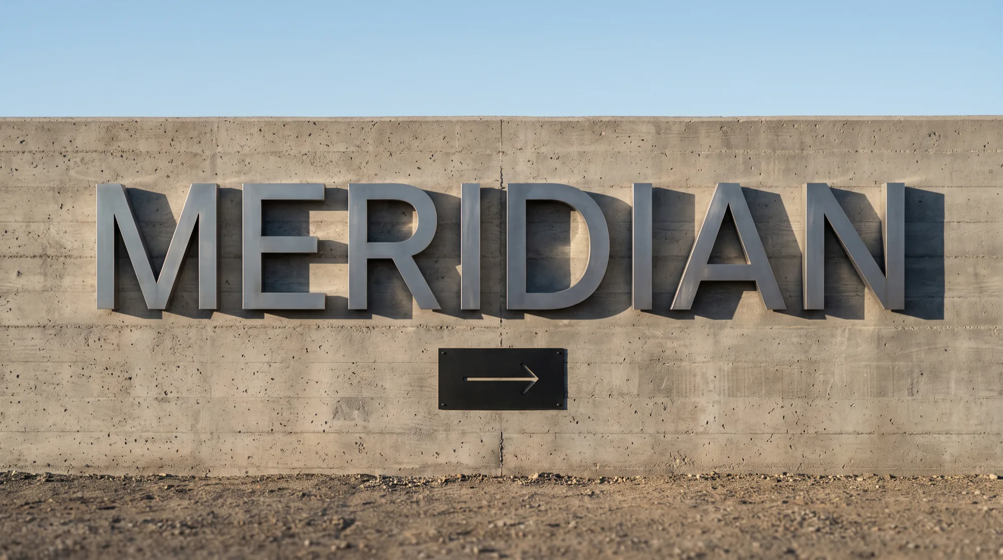
One material palette running from the key card to the wayfinding blade.
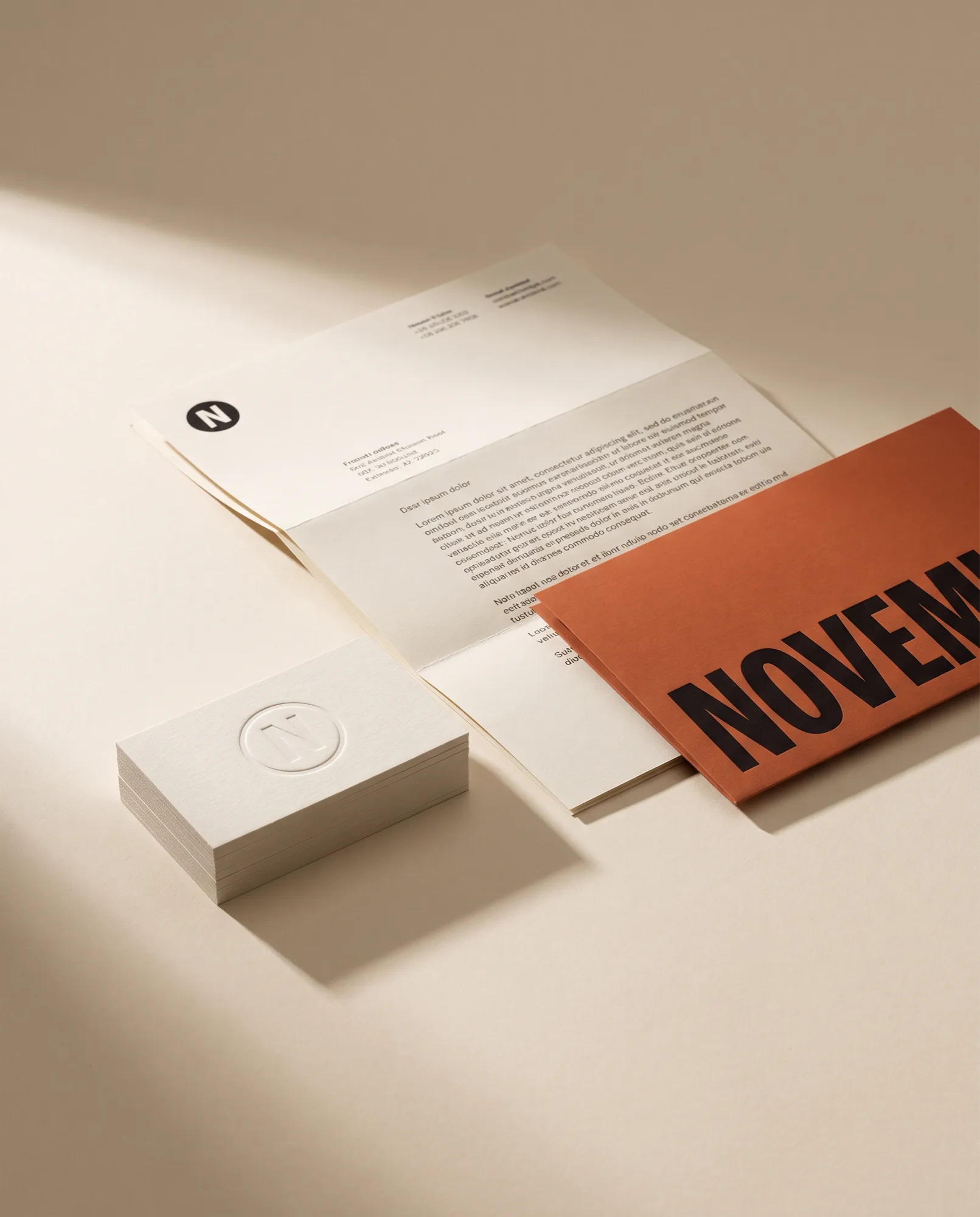
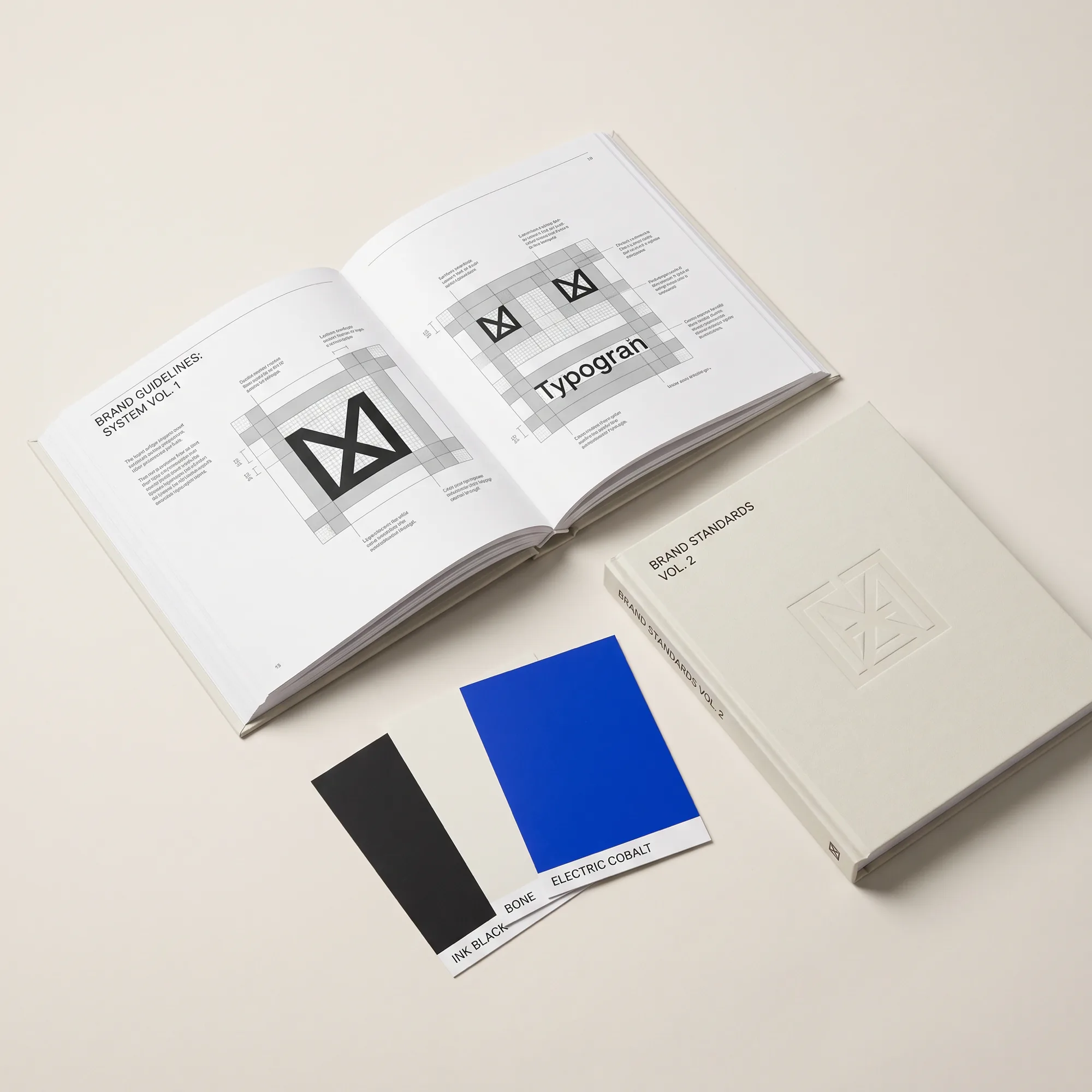
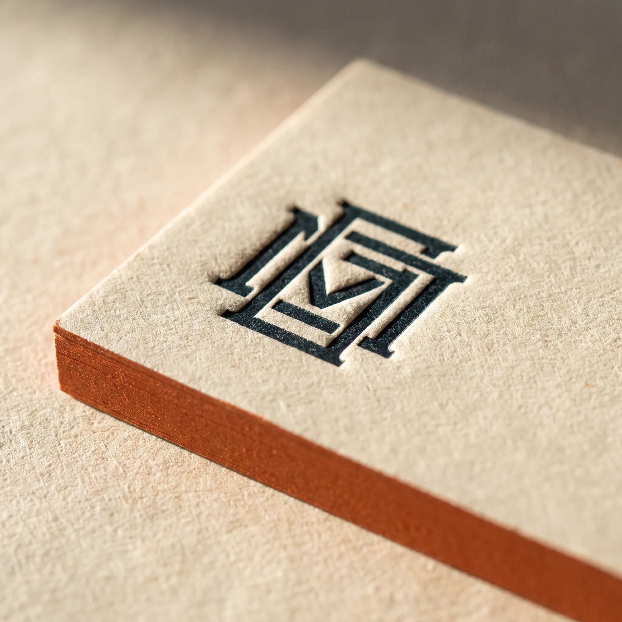
A mark that survives at nine millimetres and a print system that treats paper as a material.
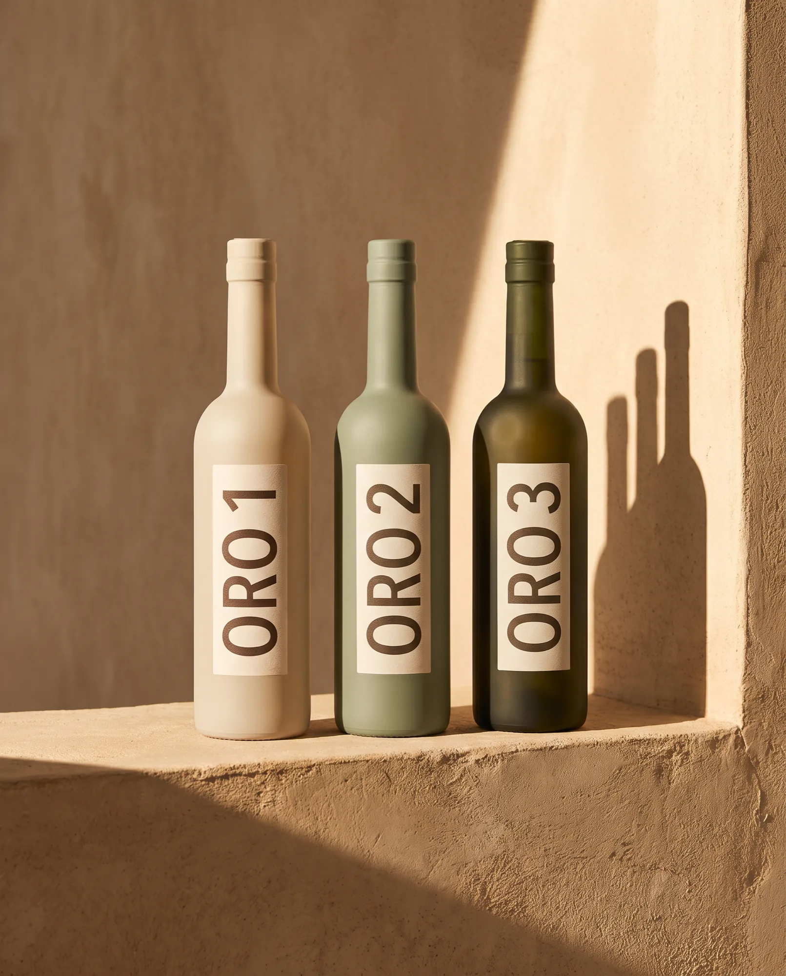
The label carries the grove, the date and nothing else.
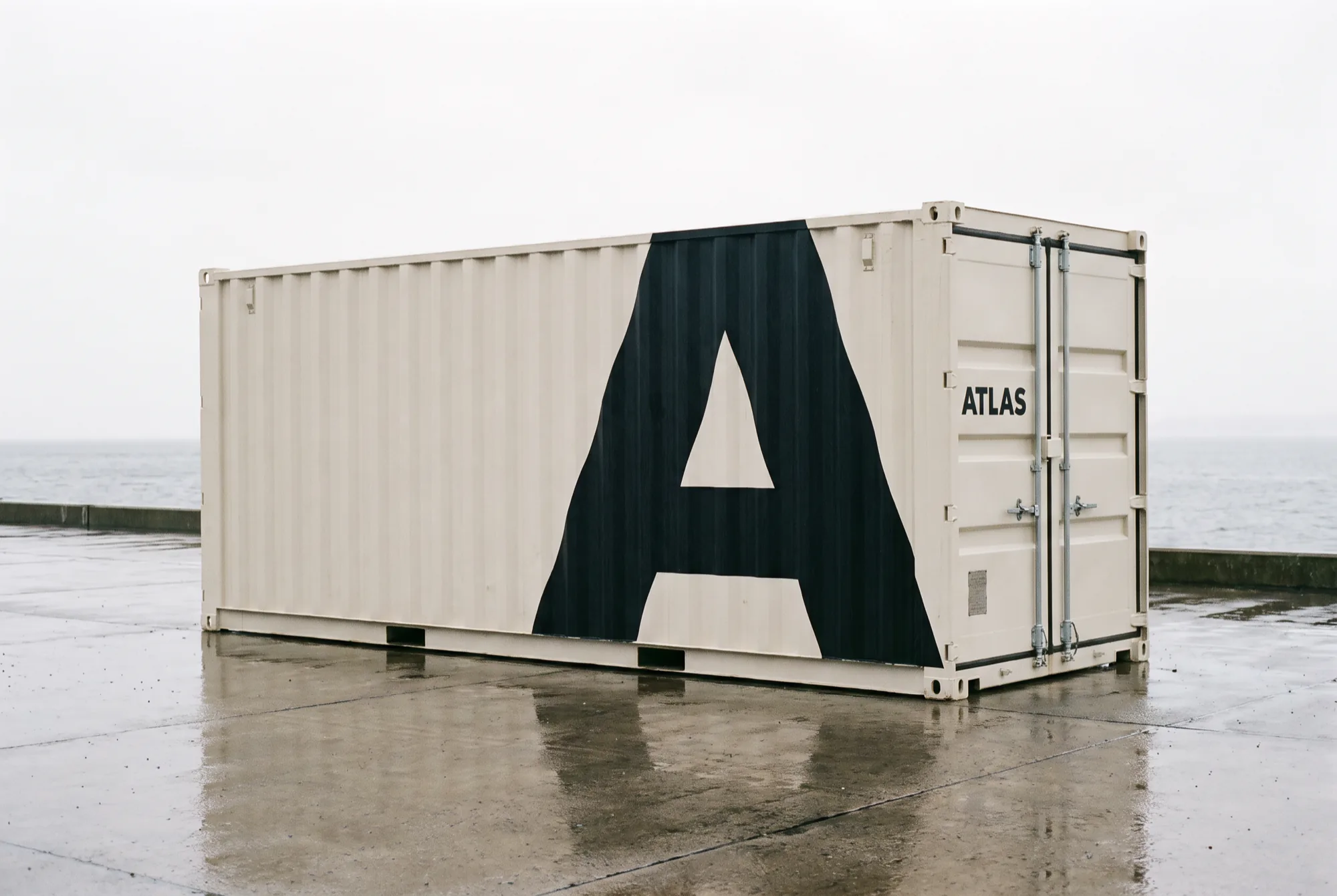
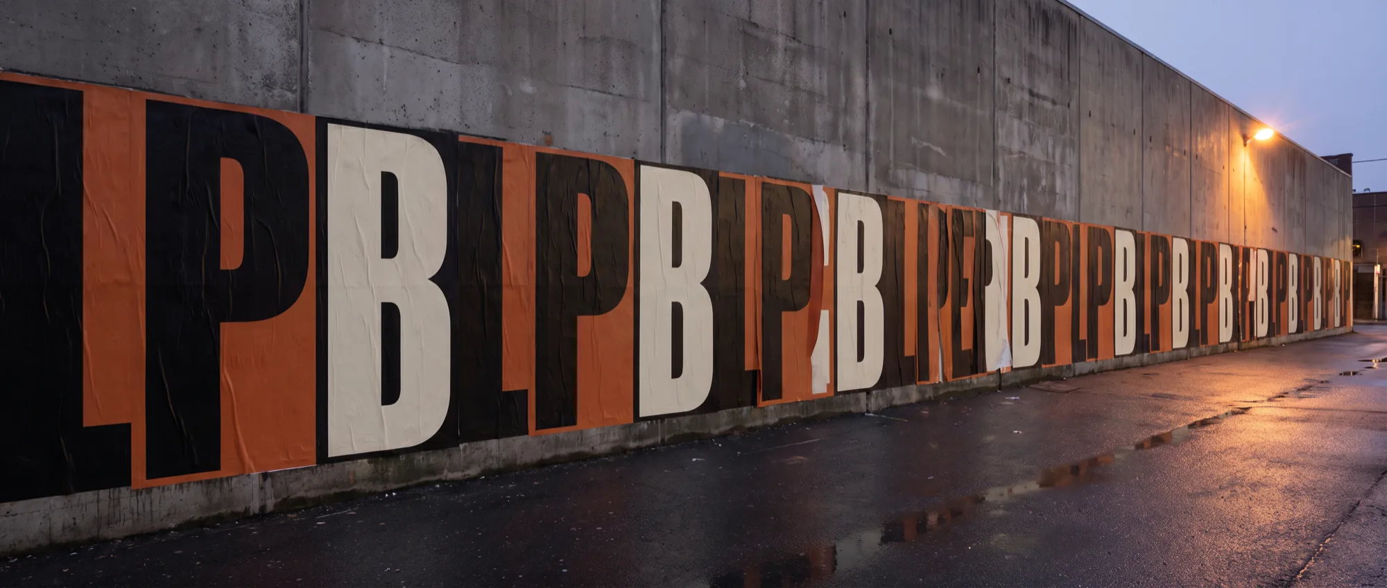
A freight identity legible at forty metres and at forty millimetres.
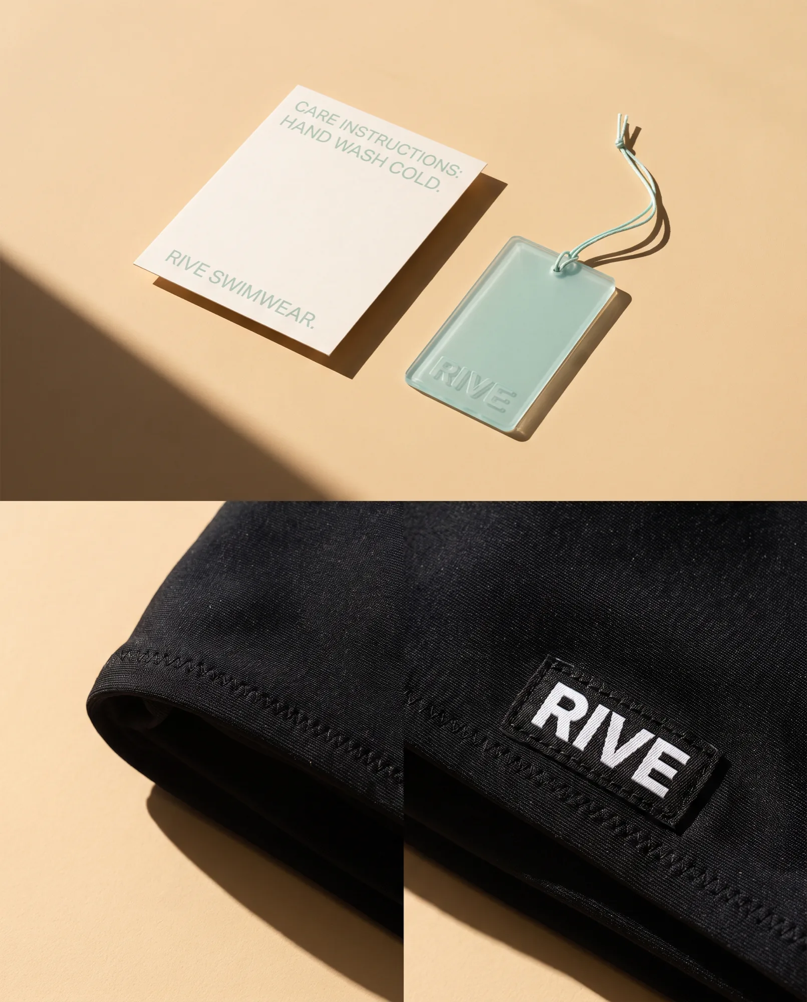
A swim label that reads as considered on the hanger and in the hand.
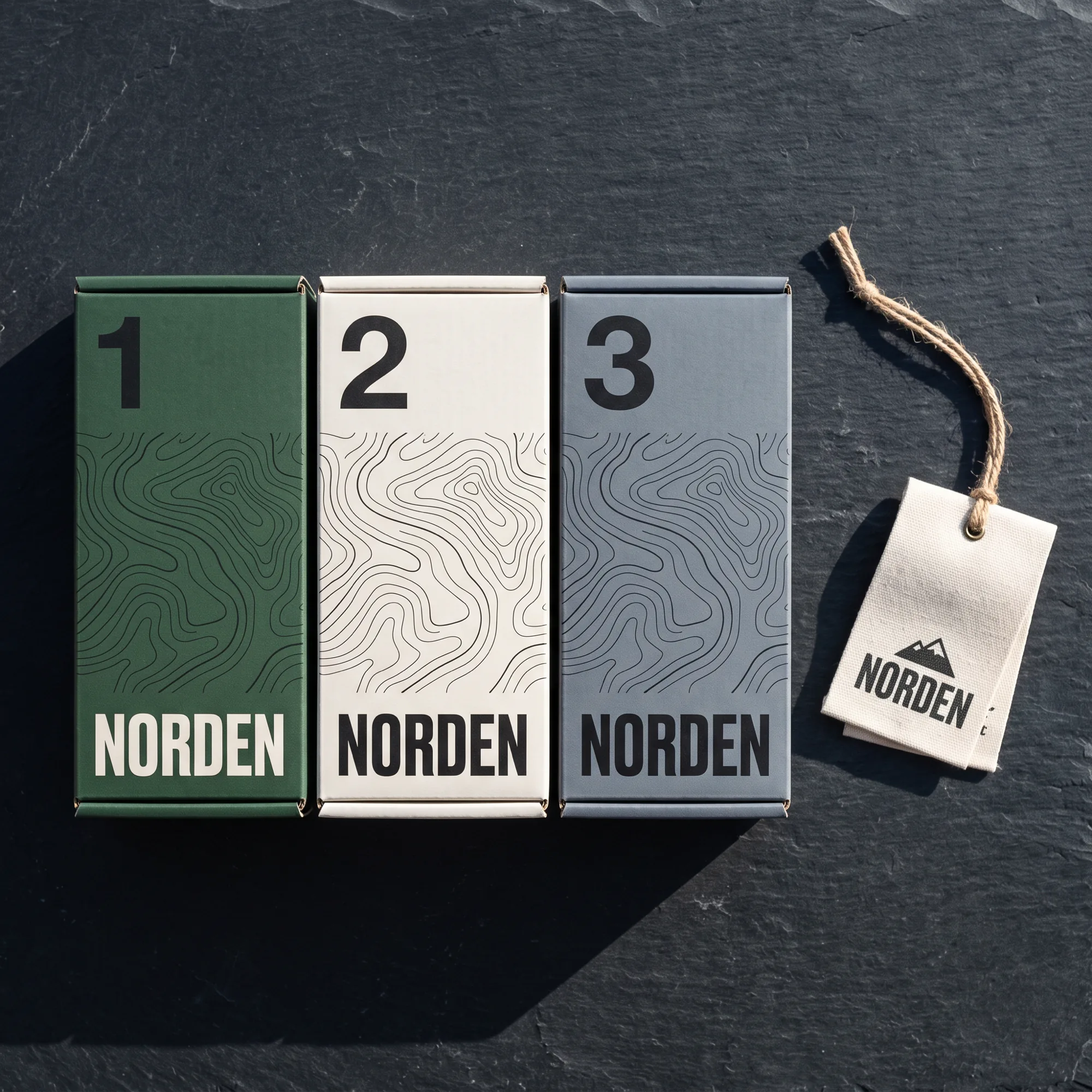
Contour lines as a system, so every box tells you where the gear is going.
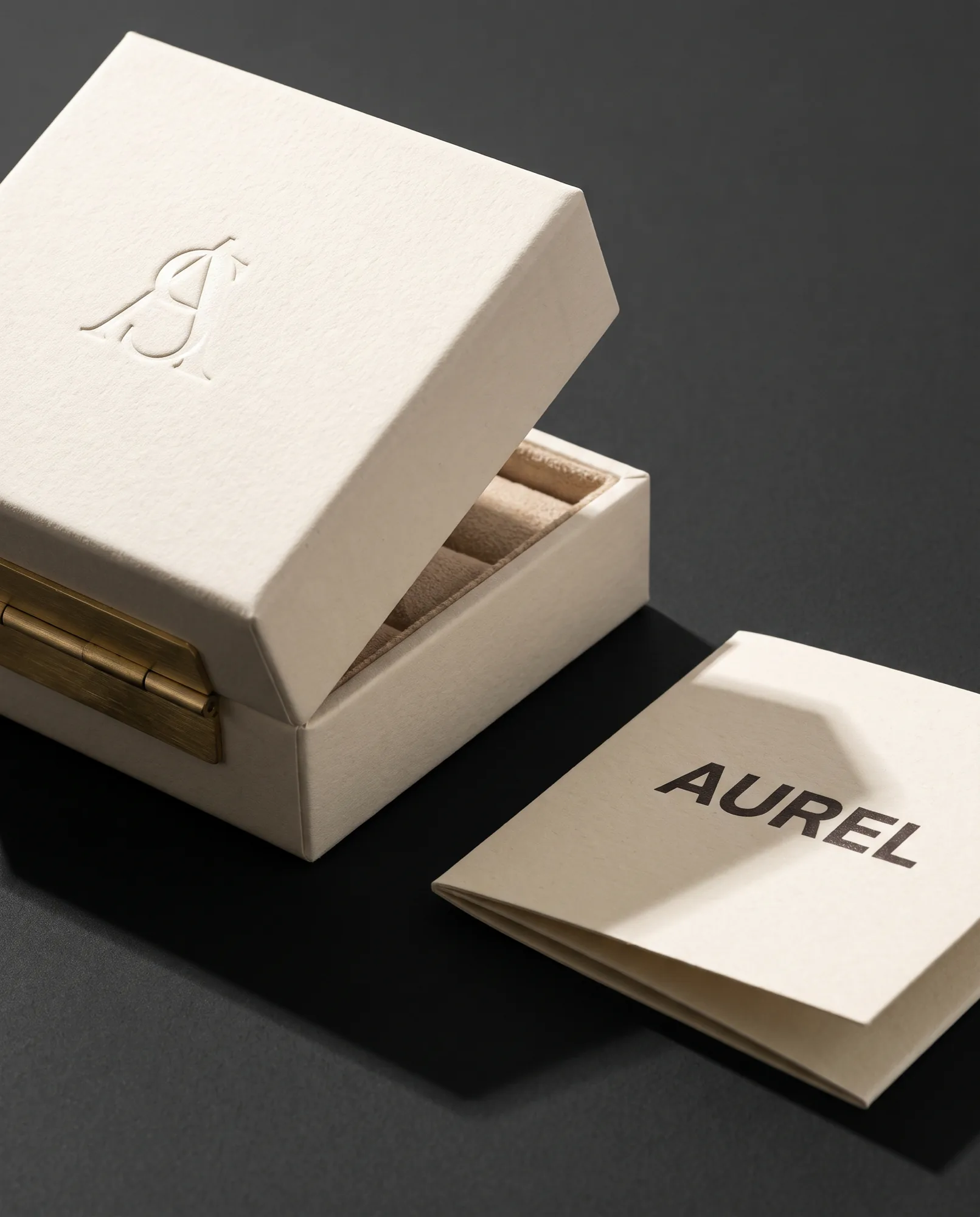
A blind emboss doing the work a gold foil usually pretends to do.
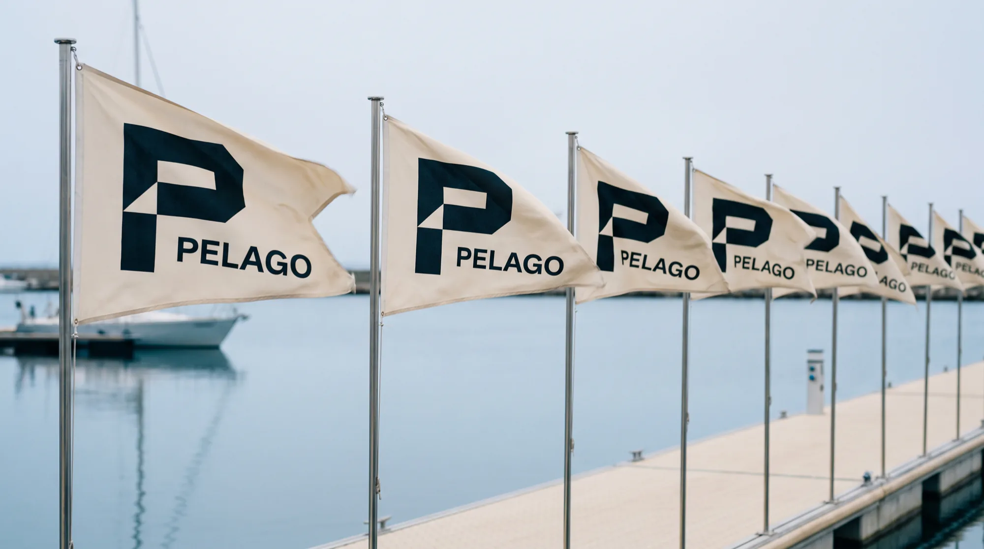
A burgee that works as a mark, an app icon and a two metre flag.
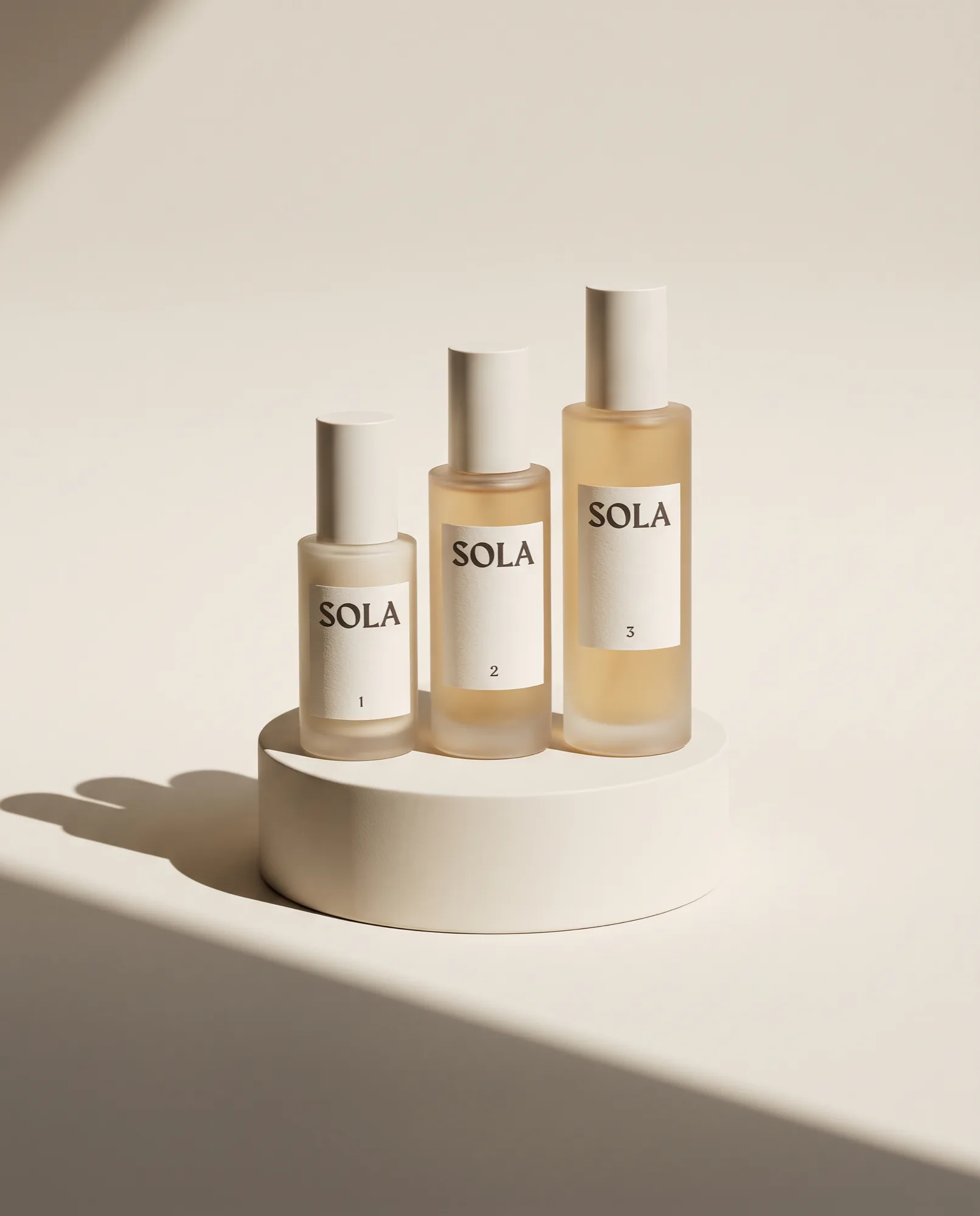
A skincare range that states the formula instead of implying a feeling.
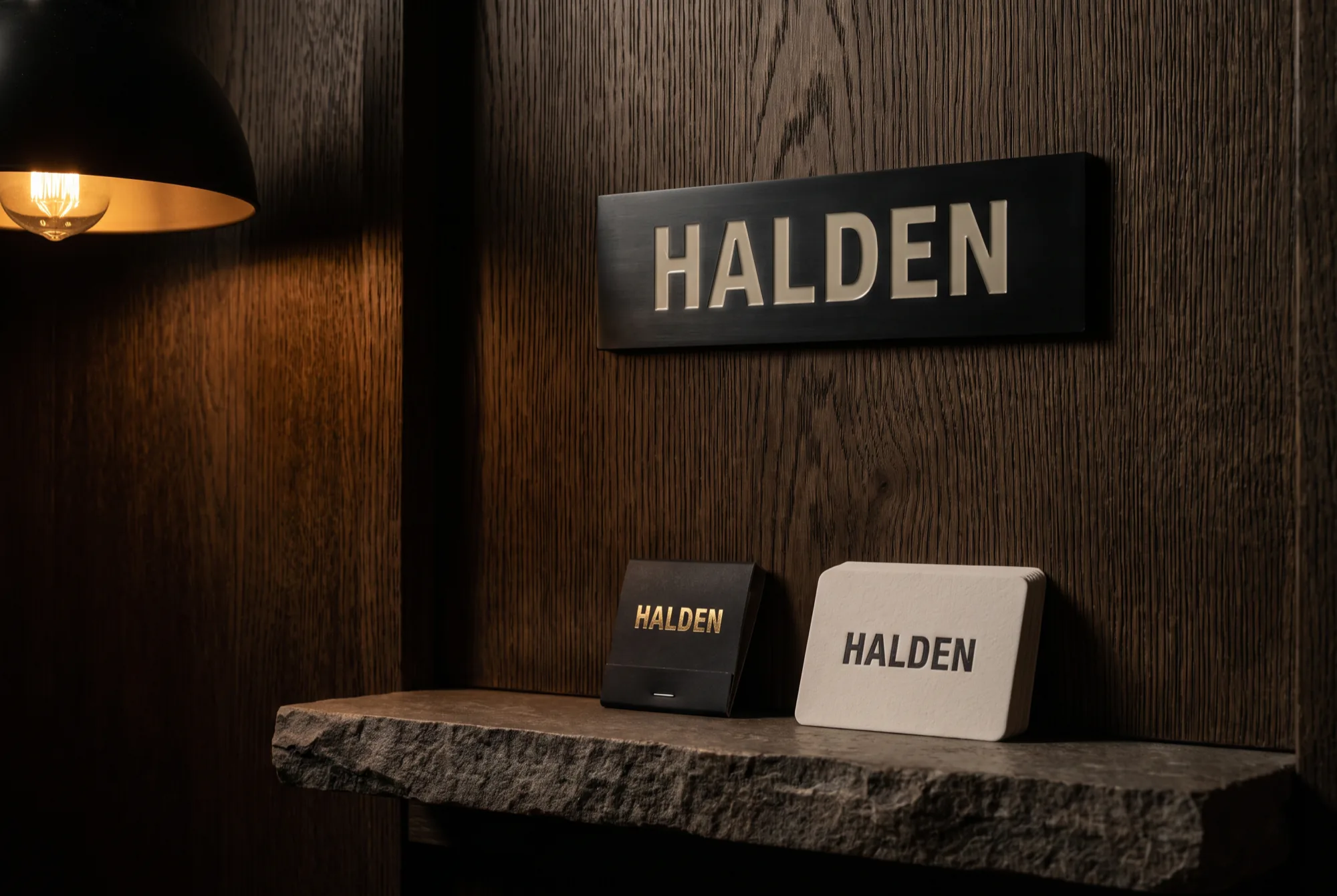
An engraved plate, a matchbook and a card, and nothing else.
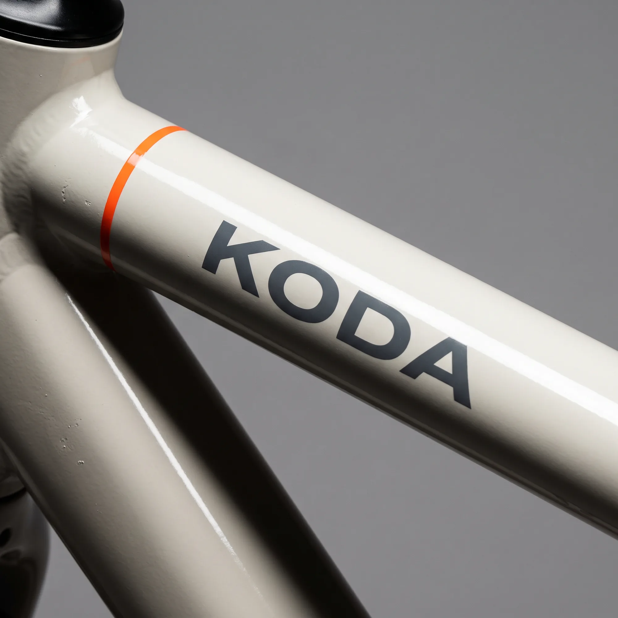
Frame graphics drawn to the tube, not applied to it.
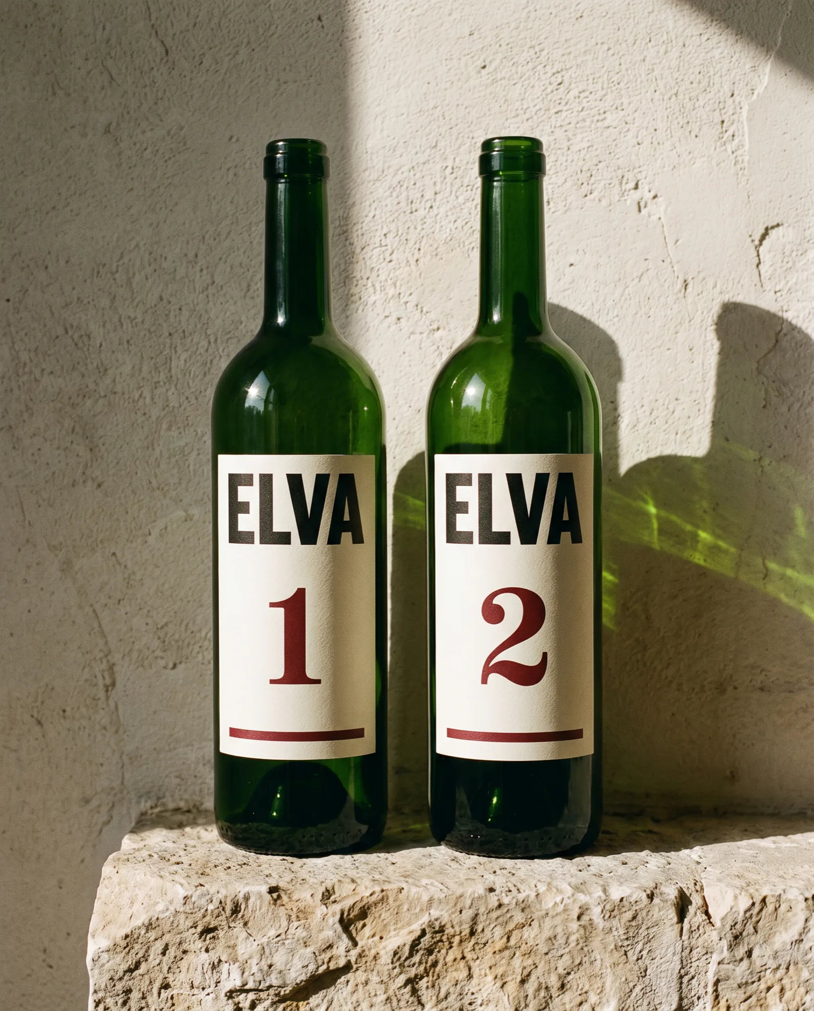
One vintage numeral doing the work of an entire back label.
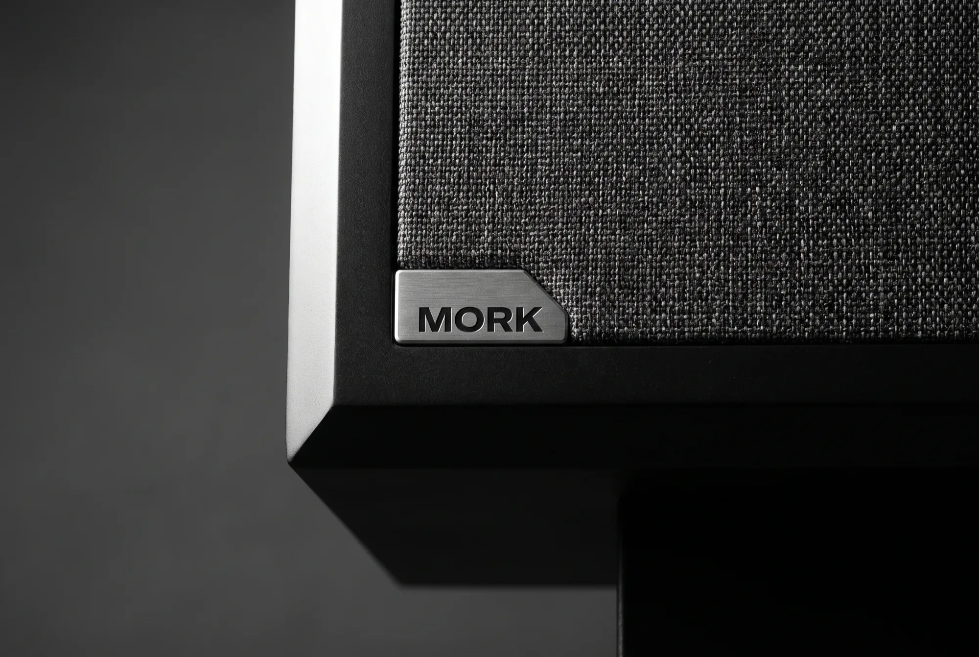
A machined badge, a control app, and no glowing lights anywhere.
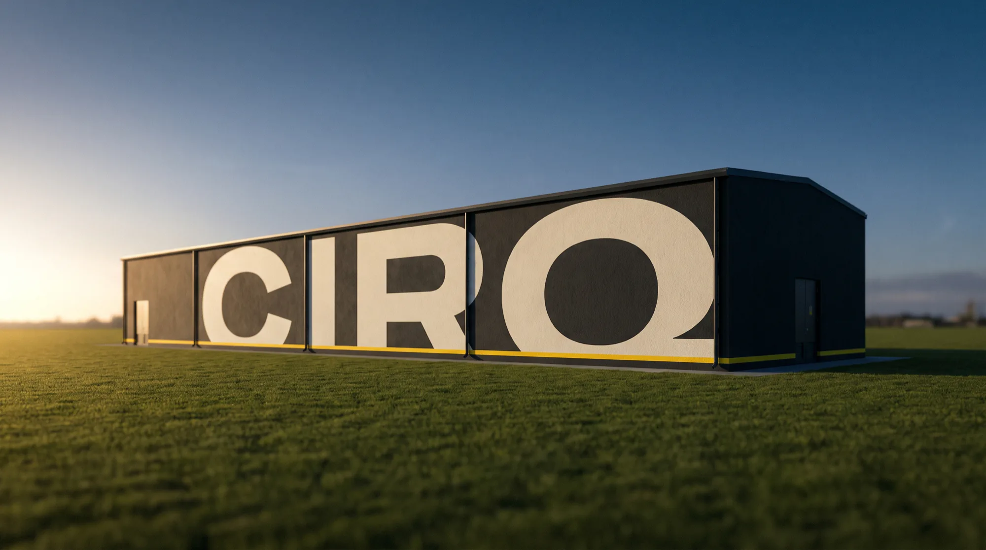
Infrastructure branded to be trusted rather than admired.
From a first funding round to a listed group. Roughly half come back inside two years for the next thing.
Clients: VELA, MERIDIAN, KIN, HALO, TERRA, SABLE, NOVEM, ORO, FLUX, ATLAS, RIVE, NORDEN, AUREL, PELAGO, SOLA, HALDEN, KODA, ELVA, MØRK, CIRQ, ALTA, BRAMA, CEDAR, DELVE, EMBER, FARO, GLYPH, HOLM, IRIS, JOULE, KESTREL, LUMEN, MARLOW, NERO, OCTA, PRISM, QUAY, ROAM, STELLE, TIDE, ULRIK, VERSO, XENO, YARD, BASALT, DUNE, ECHO, FRAME.
Strategy, identity and creative direction are the practice. The websites, products and apps are how most people will actually meet the work, so we build those too.
00
Independent since 2014, still founder led.
00
From seed stage to listed, across eight sectors.
00
Dubai, the United Kingdom and Switzerland, one standard.
00
D&AD, Type Directors Club, Red Dot, Awwwards.
Twelve to twenty weeks, depending on scope. You see the argument before you see a single piece of artwork.
Two weeks inside the business.
Leadership, customers, the numbers, the competition. We come back with the argument, not a moodboard.
They arrived with an argument,not a mood board. Six weeks laterthe whole company was using thesame words to describe what we do.
The design followed from that, and it has not needed rescuing since.
Ines Kaufmann / Chief Executive, VELA Aviation
New projects, collaborations and the occasional argument about kerning. We answer every brief within two working days.