

NUVU refuses to look institutional.
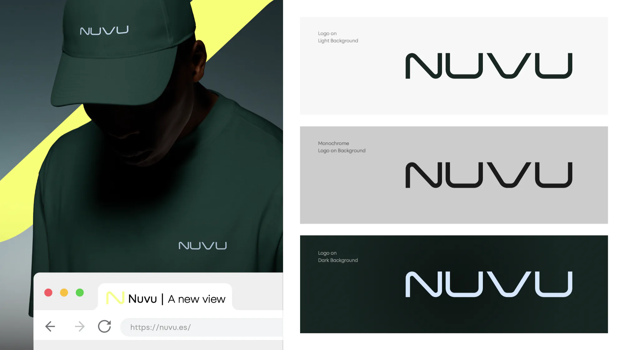
An underwriter for brokers, drawn as one continuous curve instead of a crest.
- NuVu Underwriting
- Finance
- nuvu.es
- 2026
- Identity, Art direction, Campaign, Collateral
NuVu underwrites for brokers, and the founding line is a complaint about the category: brokers deserve a real partner, not a distant institution. So the identity had to read as somebody on the other end of a phone rather than as a headquarters.
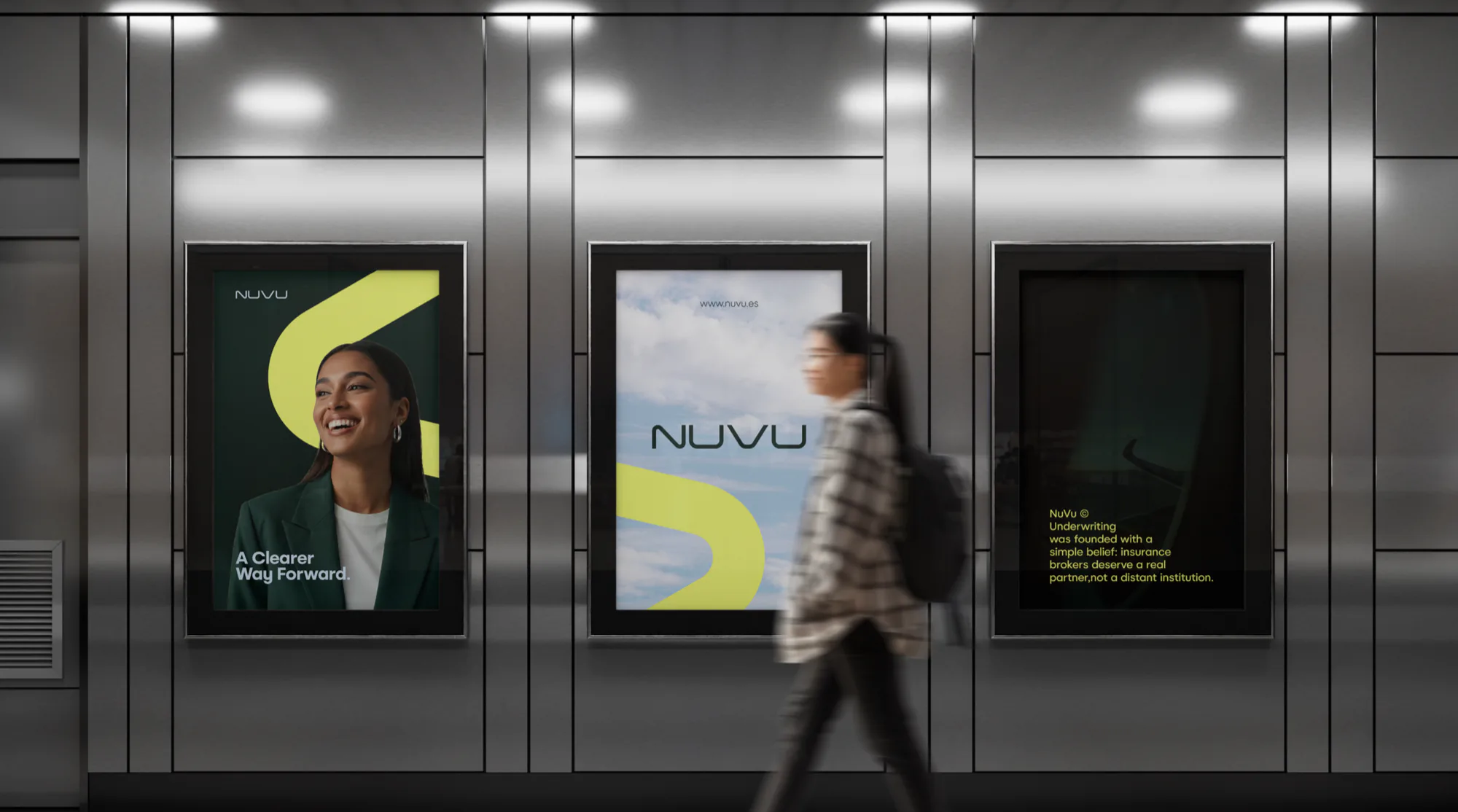
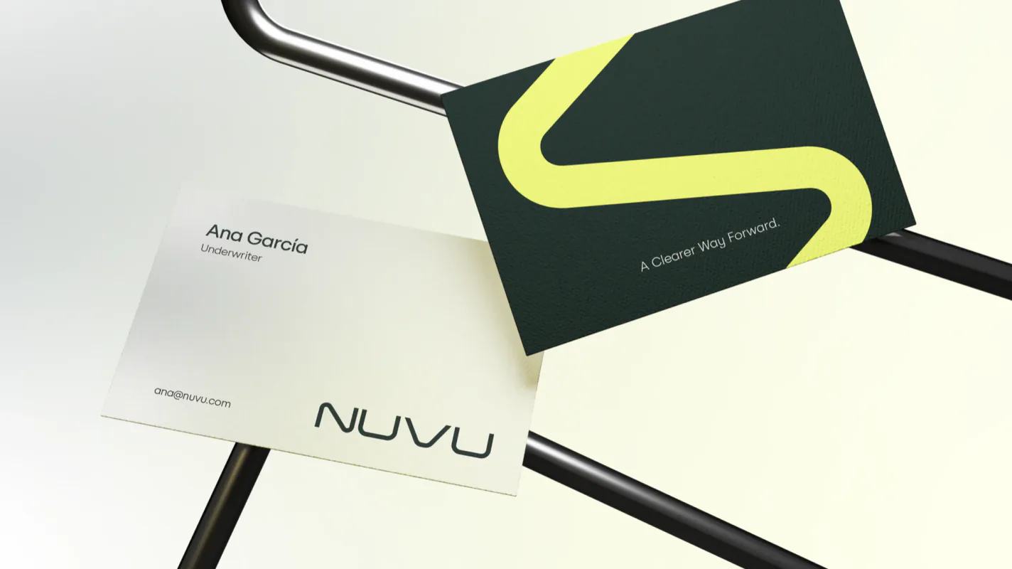
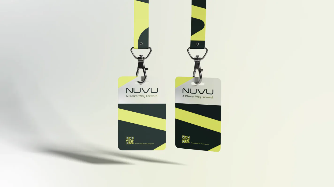
The mark is one continuous stroke. The N and the U are cut from the same curve, and that curve then leaves the wordmark and becomes the only device the brand owns: a citrus ribbon that bends across a metro poster, wraps a car, and turns up again as a diagonal on a pass.
Pine and citrus, where the category defaults to navy and gold. That is the fastest way to be recognised in a corridor of insurance advertising, and it costs nothing in seriousness: the green is dark enough to carry a policy document.
A crest says we have been here a long time. A curve says we are going somewhere, and brokers are not buying history.

Services used
Tell us what you are building.
New projects, collaborations and partnerships. We read every brief ourselves and answer within two working days.