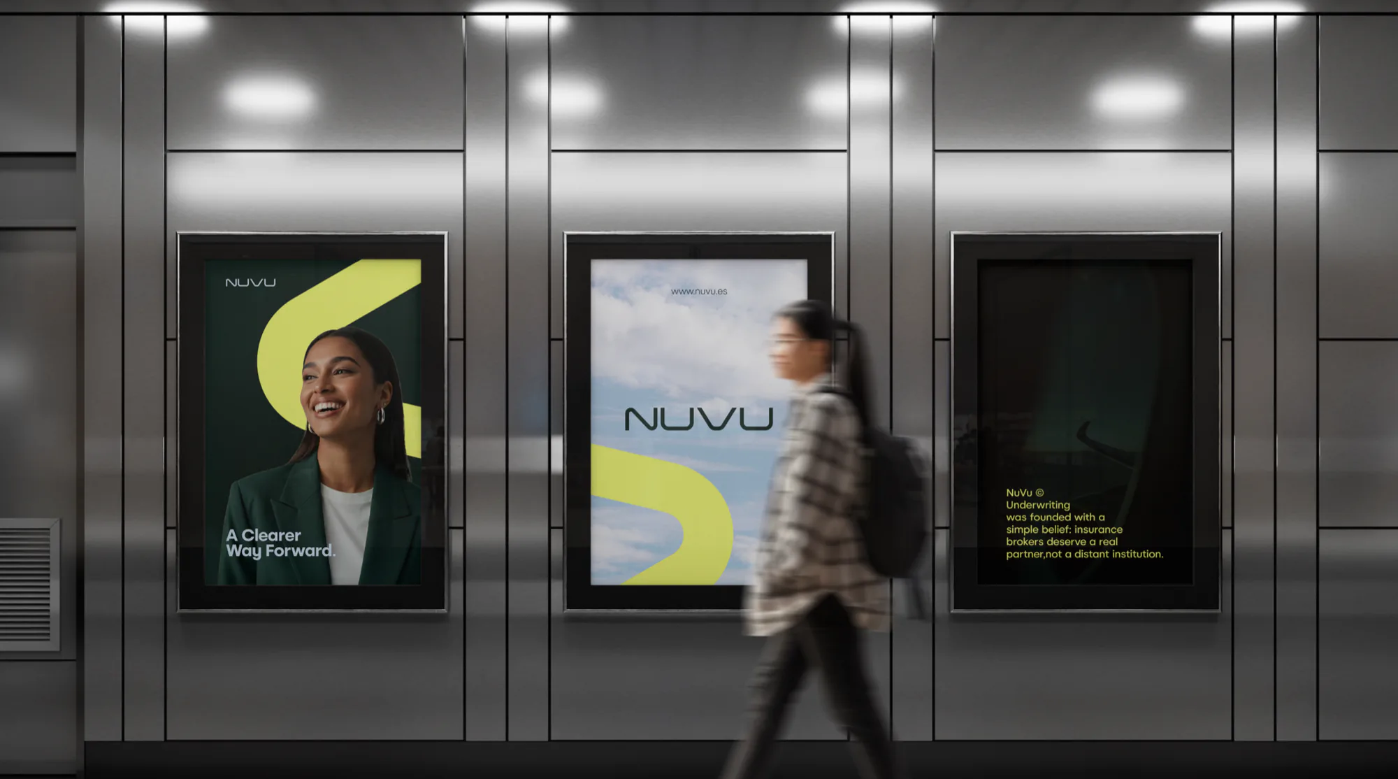
NUVU refuses to look institutional.
An underwriter for brokers, drawn as one continuous curve instead of a crest.
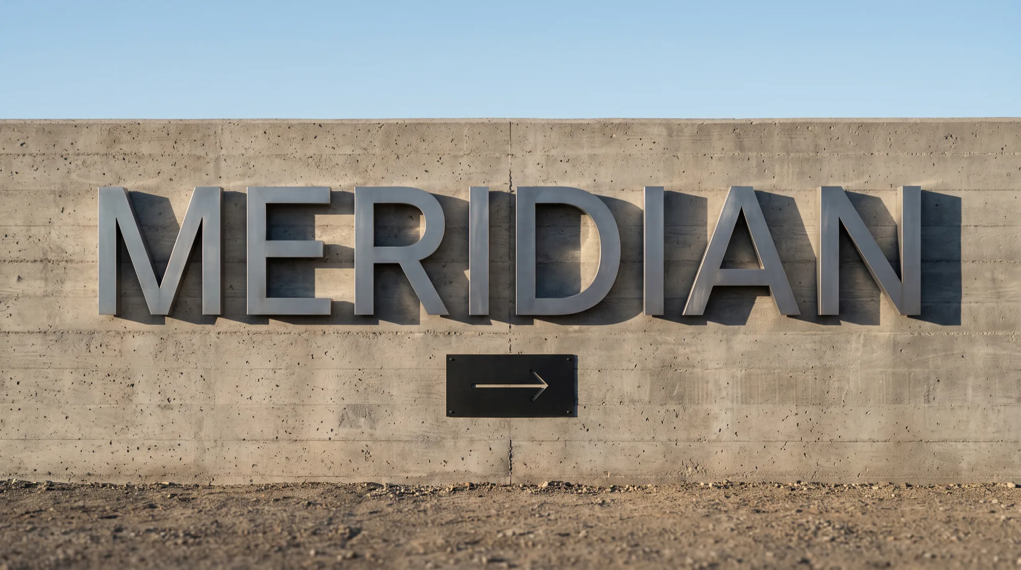
One typographic system, scaled from a ticket to a nine metre banner.
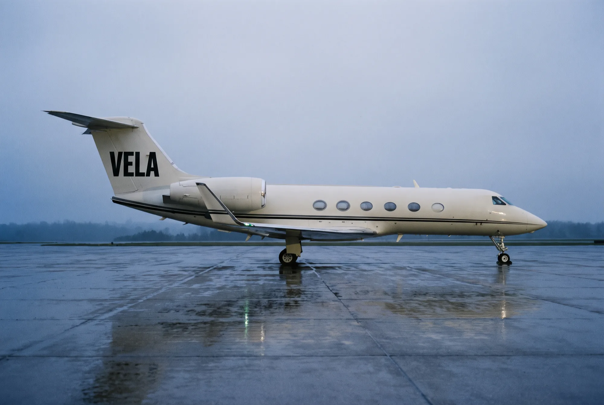
The restraint of an instrument panel, the confidence of a flag.
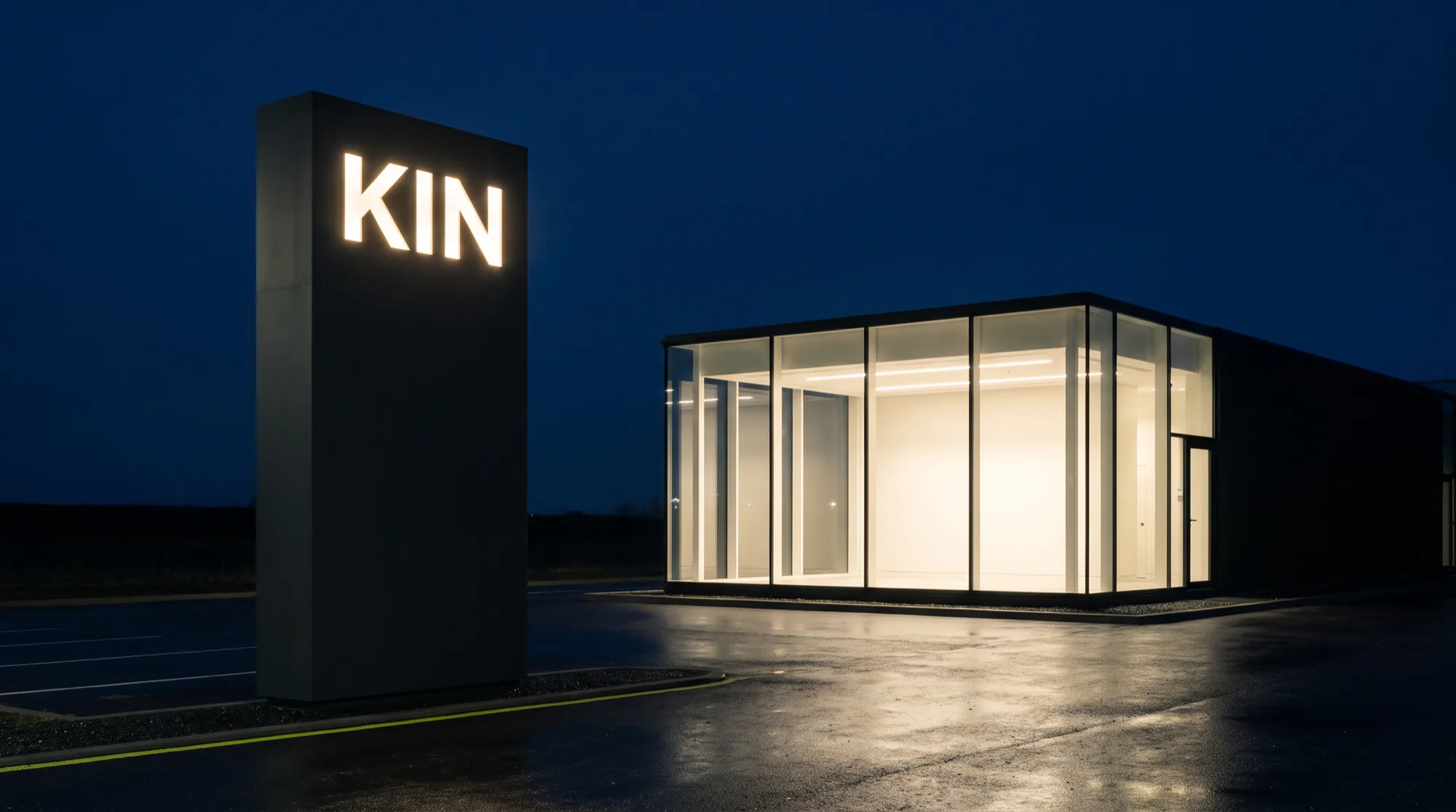
We took the volume out of the design and put it into the stance.
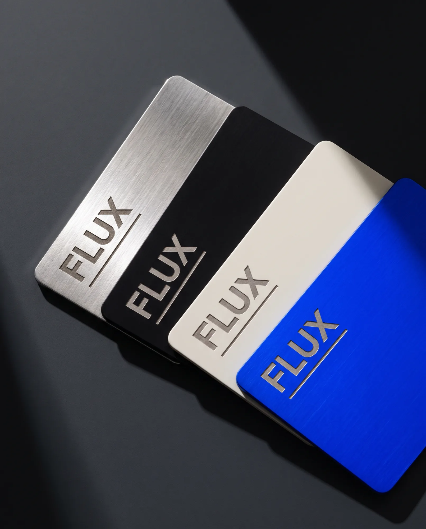
Every gesture toward wealth removed, so the material could talk.
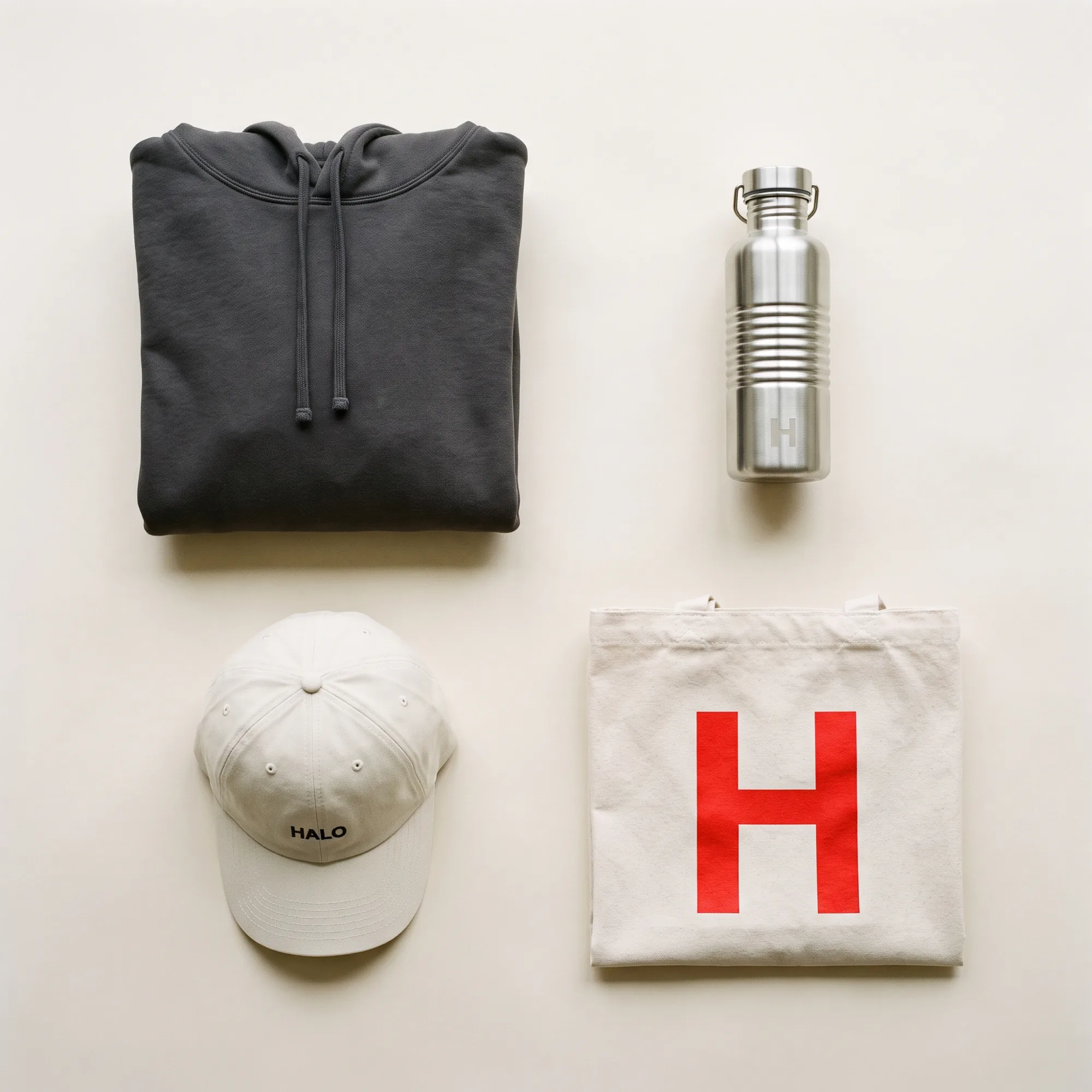
One cropped letterform, at every scale from a cap to a delivery fleet.
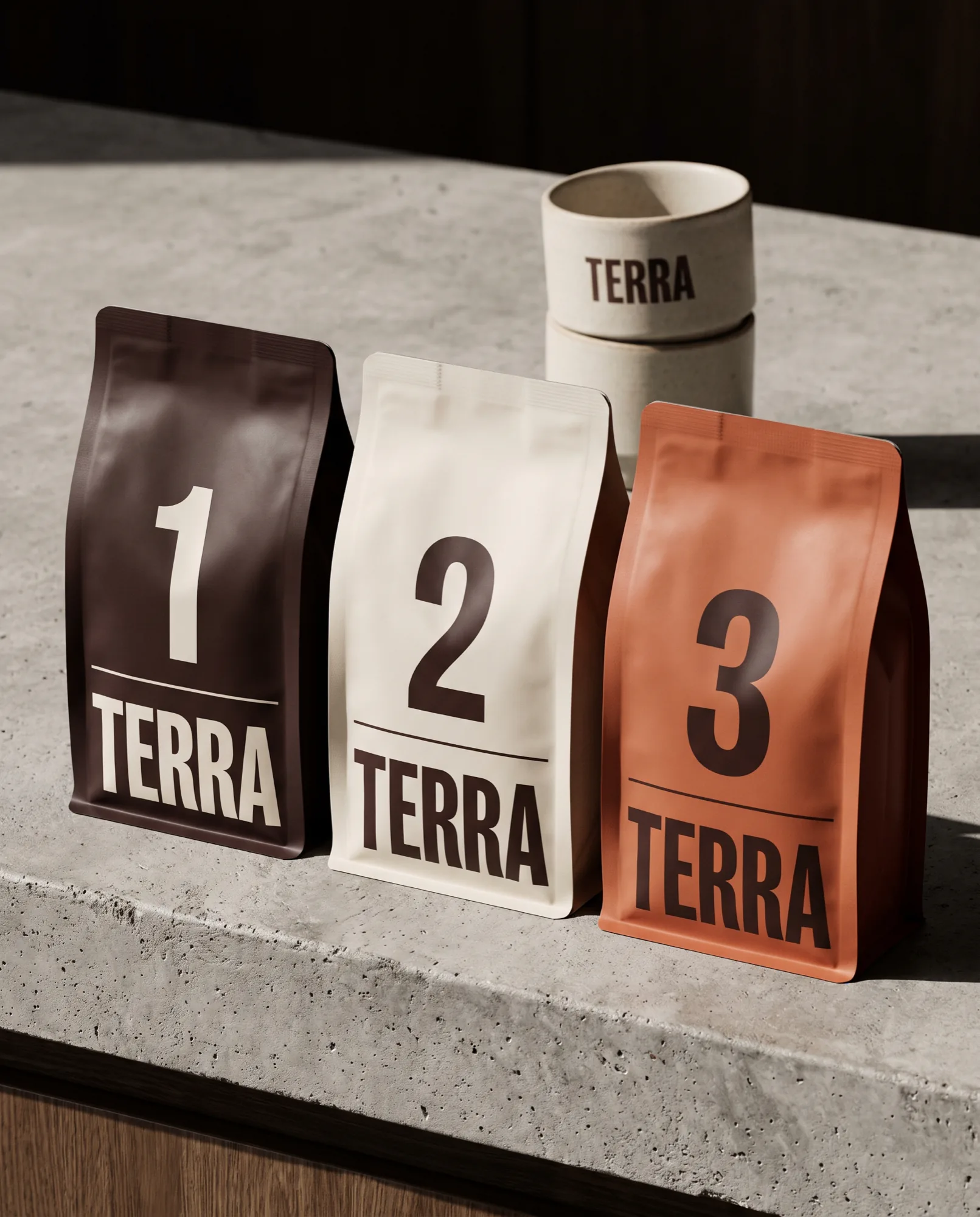
Illustration replaced with information, set to be read from a metre away.
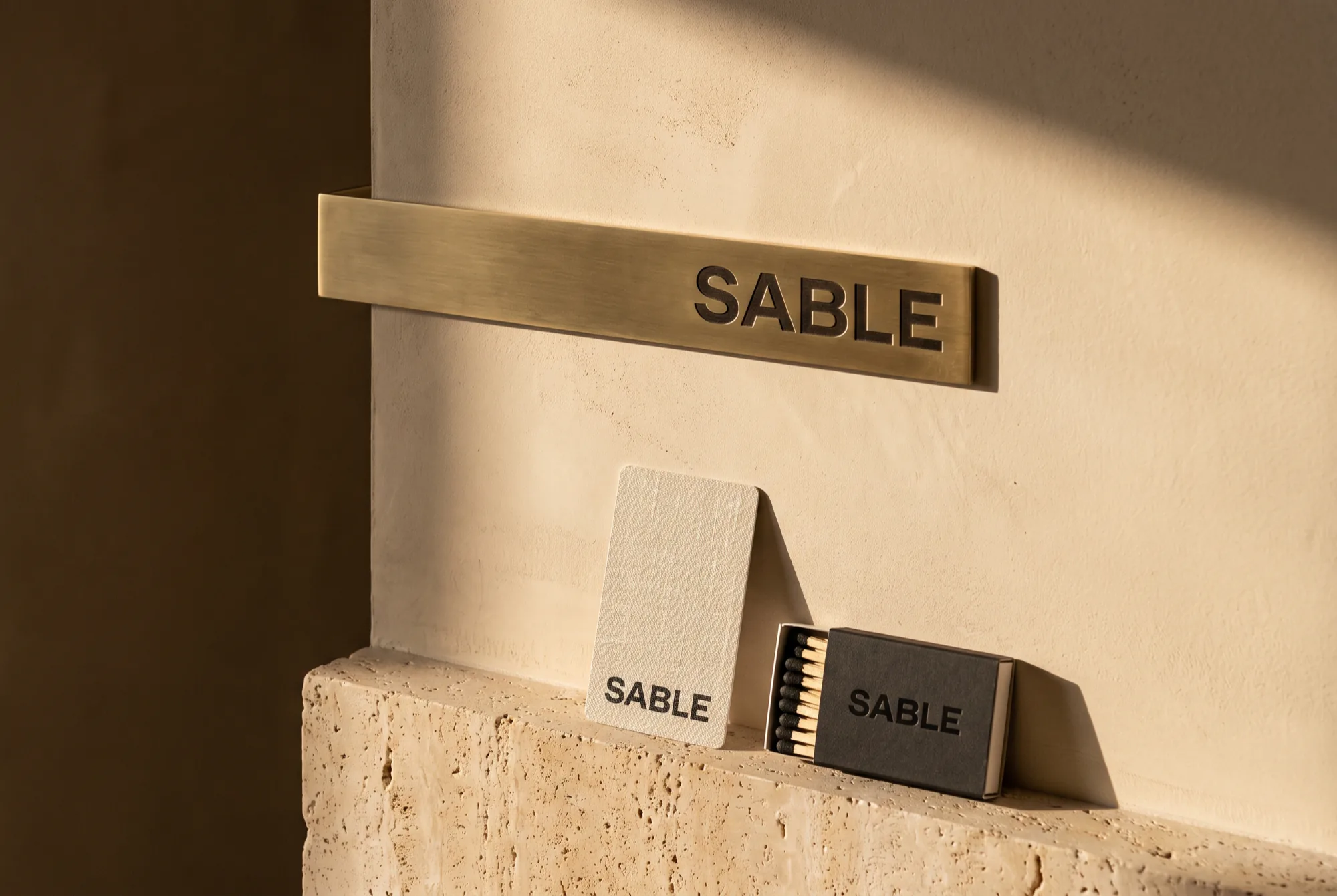
One material palette from the key card to the wayfinding blade.
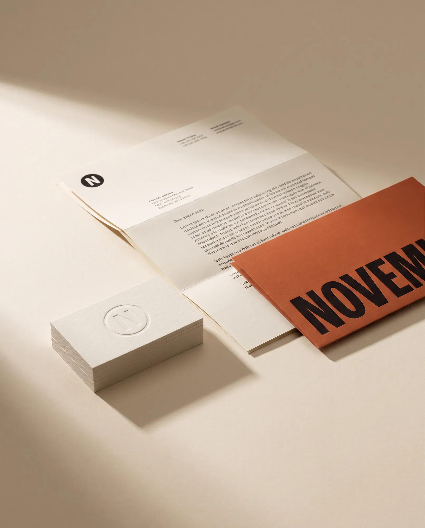
A mark that survives at nine millimetres, on paper treated as a material.
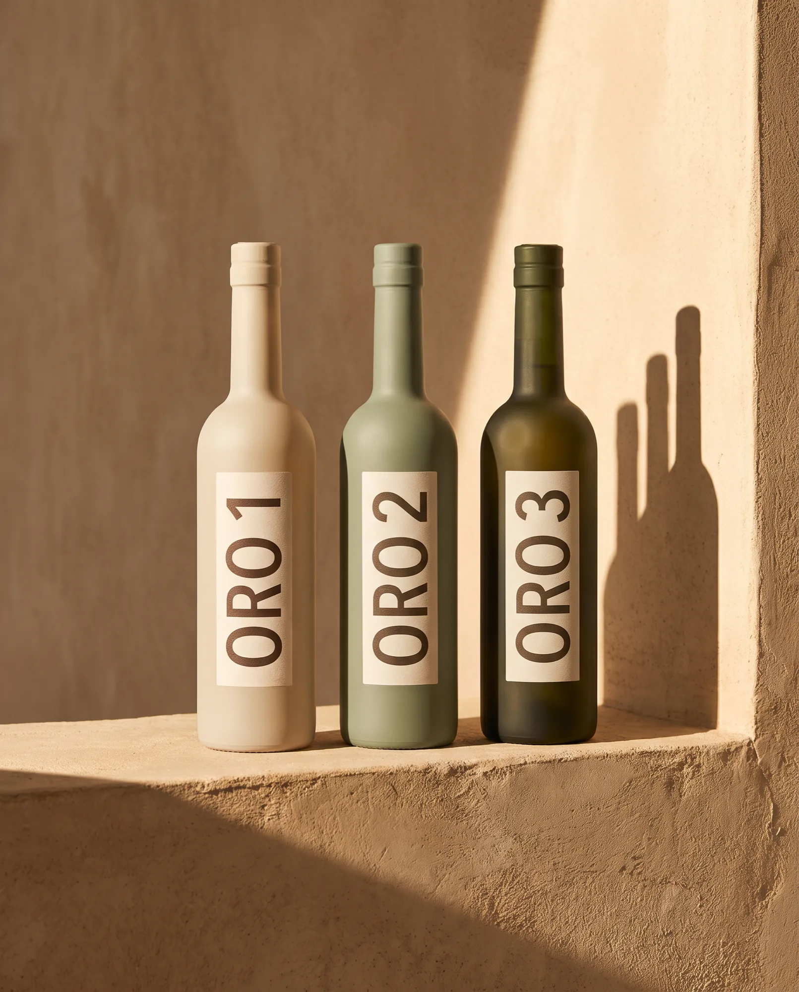
The label carries the grove, the date and nothing else.
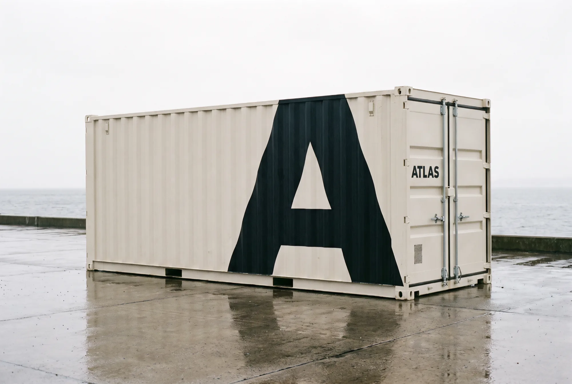
A freight identity legible at forty metres and at forty millimetres.
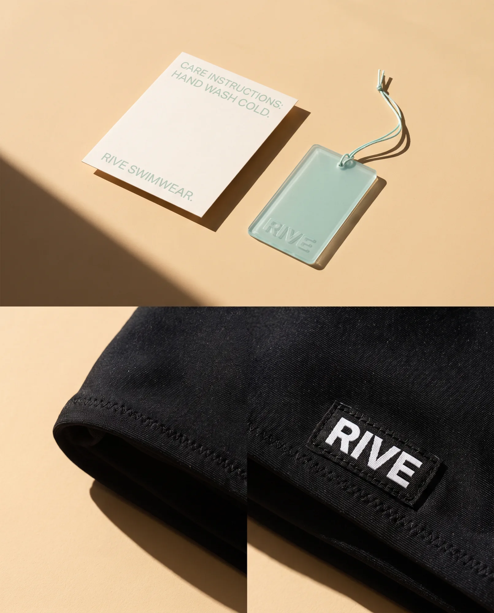
The craft moved onto the label, the tag and the care card.
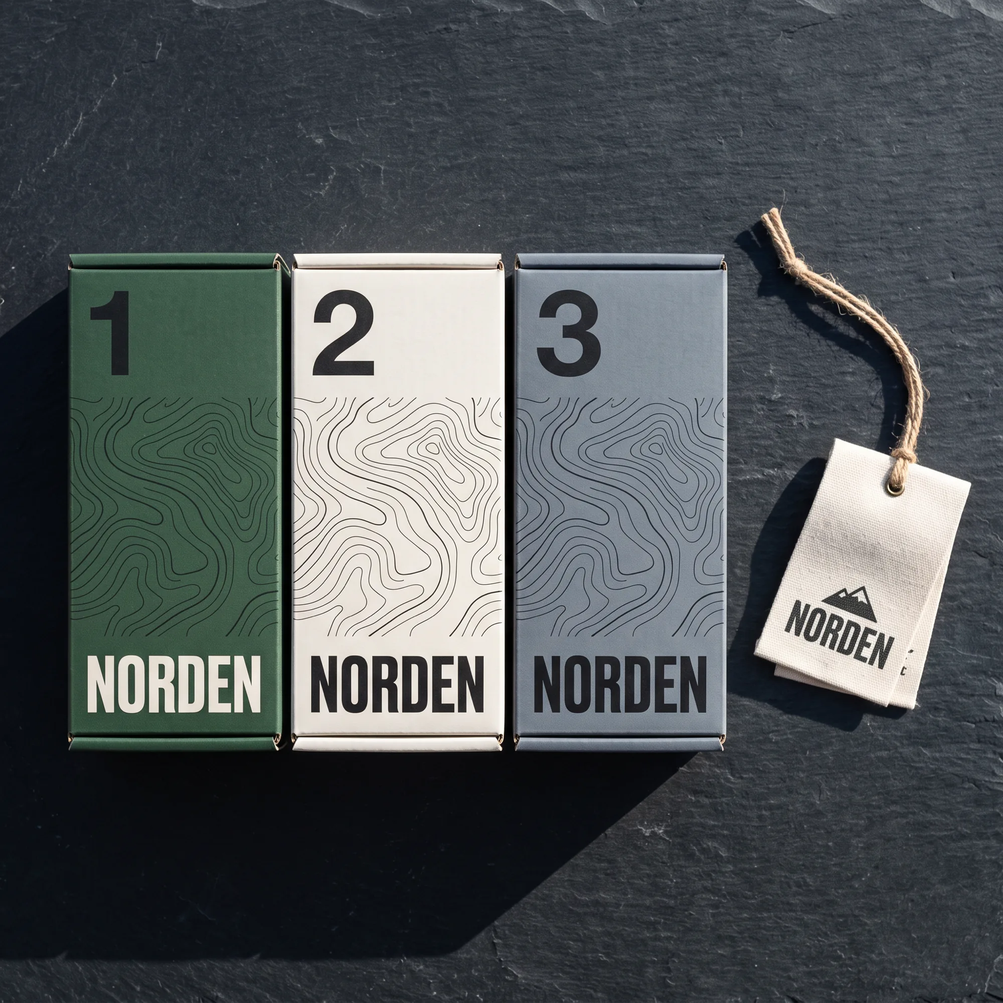
Contour lines index every product to the terrain it is built for.
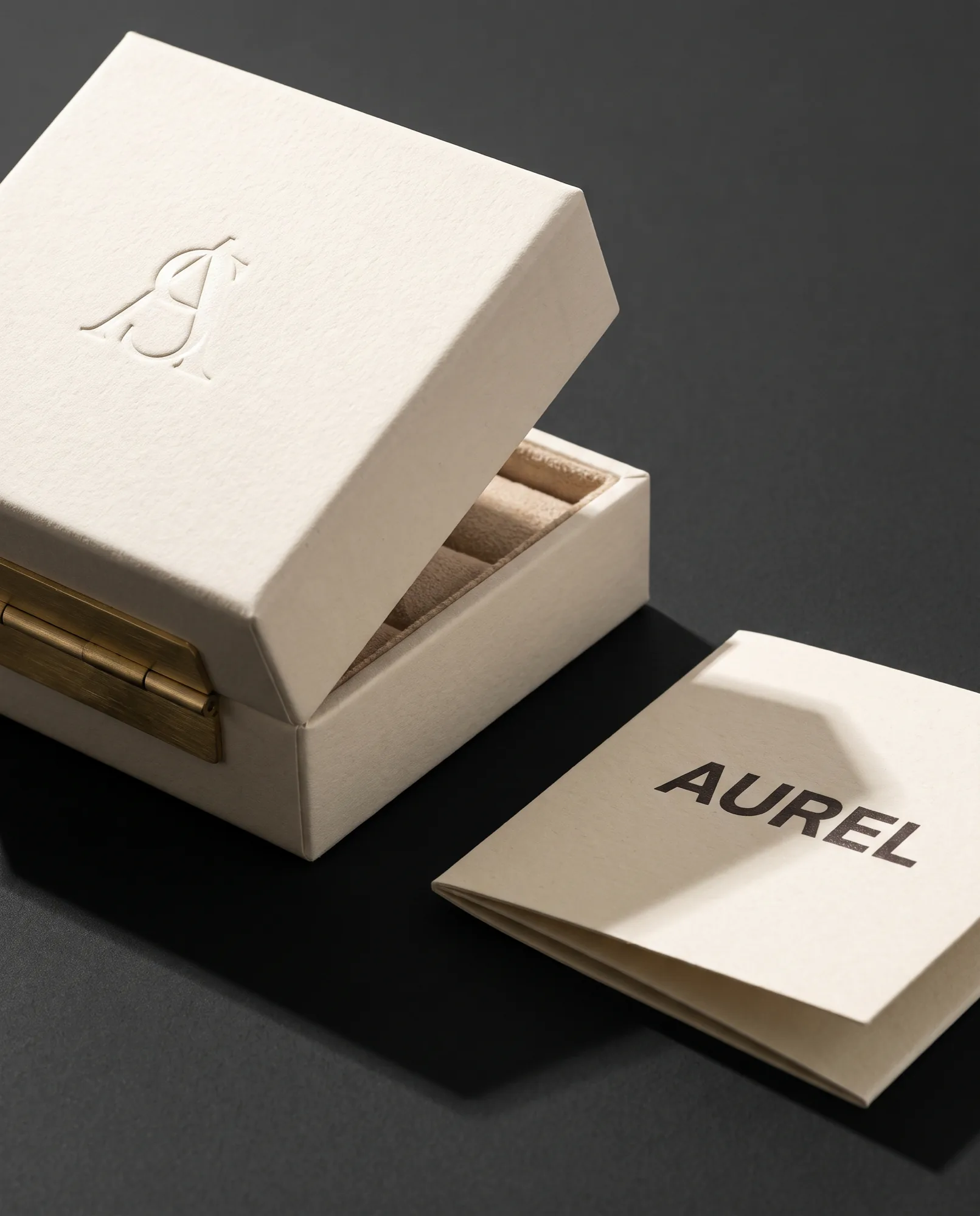
A blind emboss doing the work a gold foil usually pretends to do.
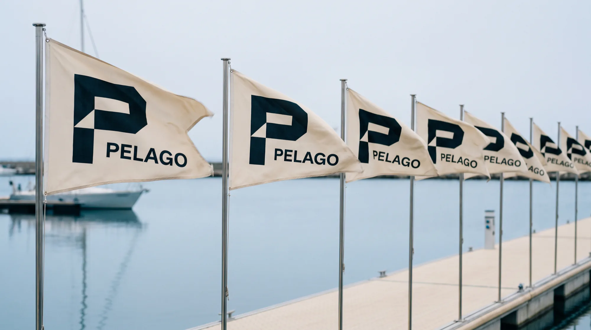
A mark drawn to survive wind, salt and a 64 pixel app icon.

The formula made the hero and the marketing made the footnote.
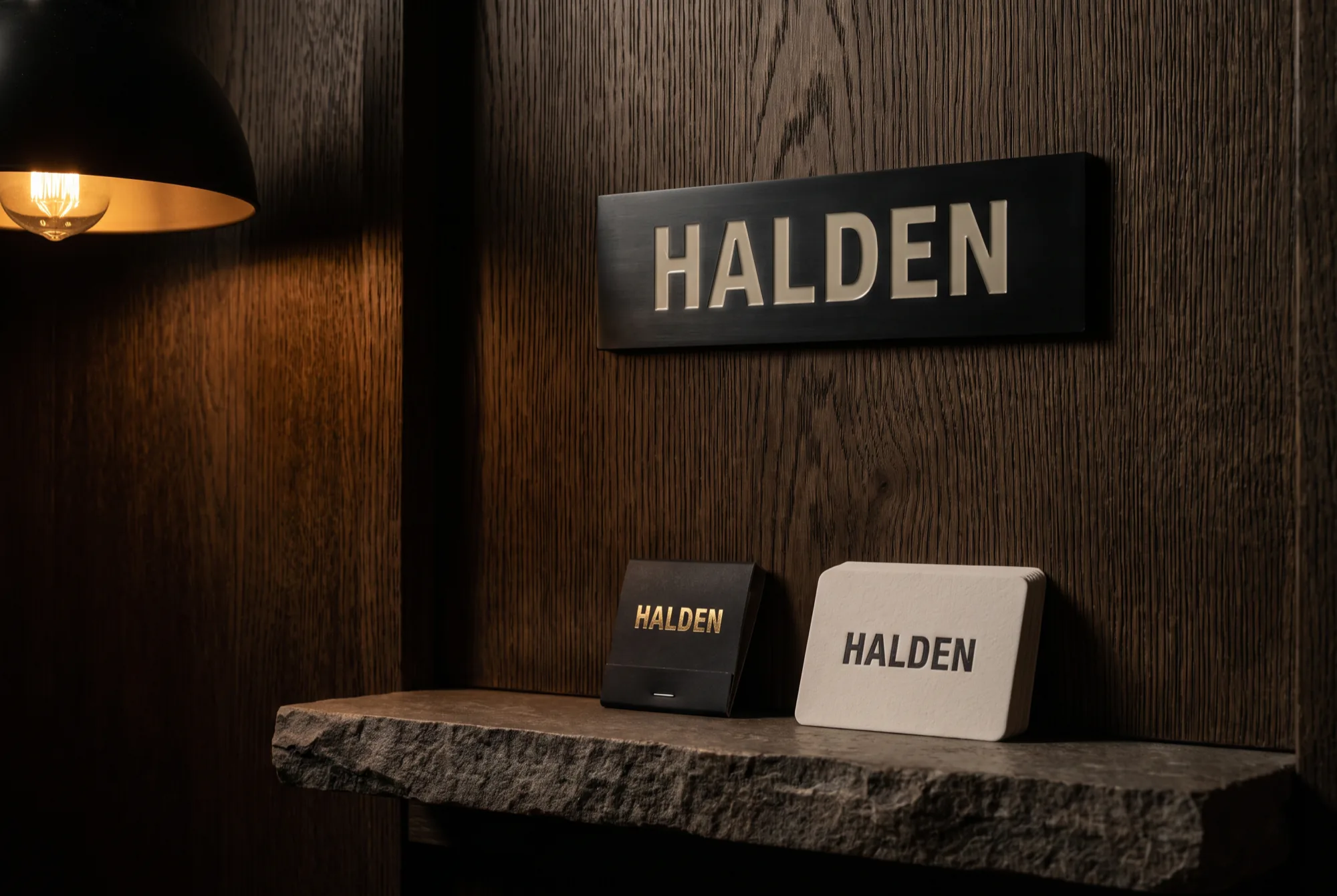
An engraved plate, a matchbook and a card, and nothing else.
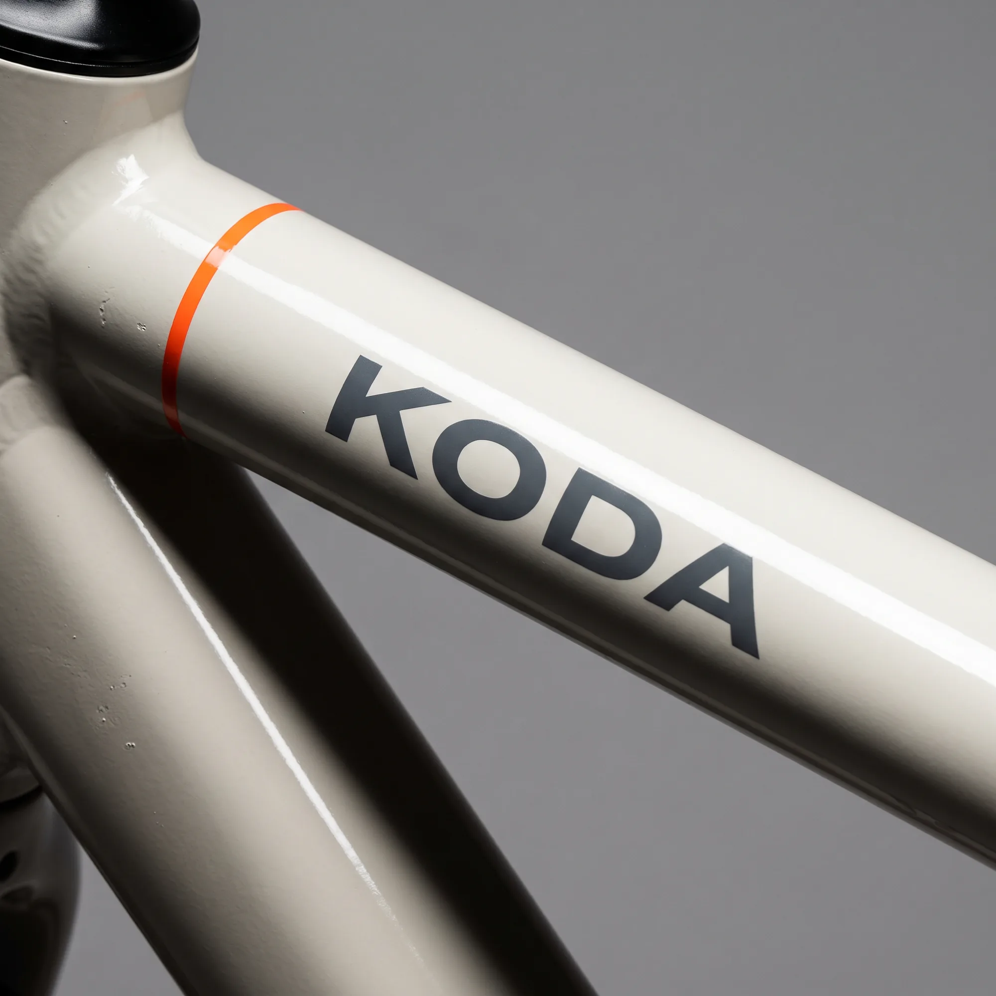
Graphics drawn to the geometry of each model, never applied on top.
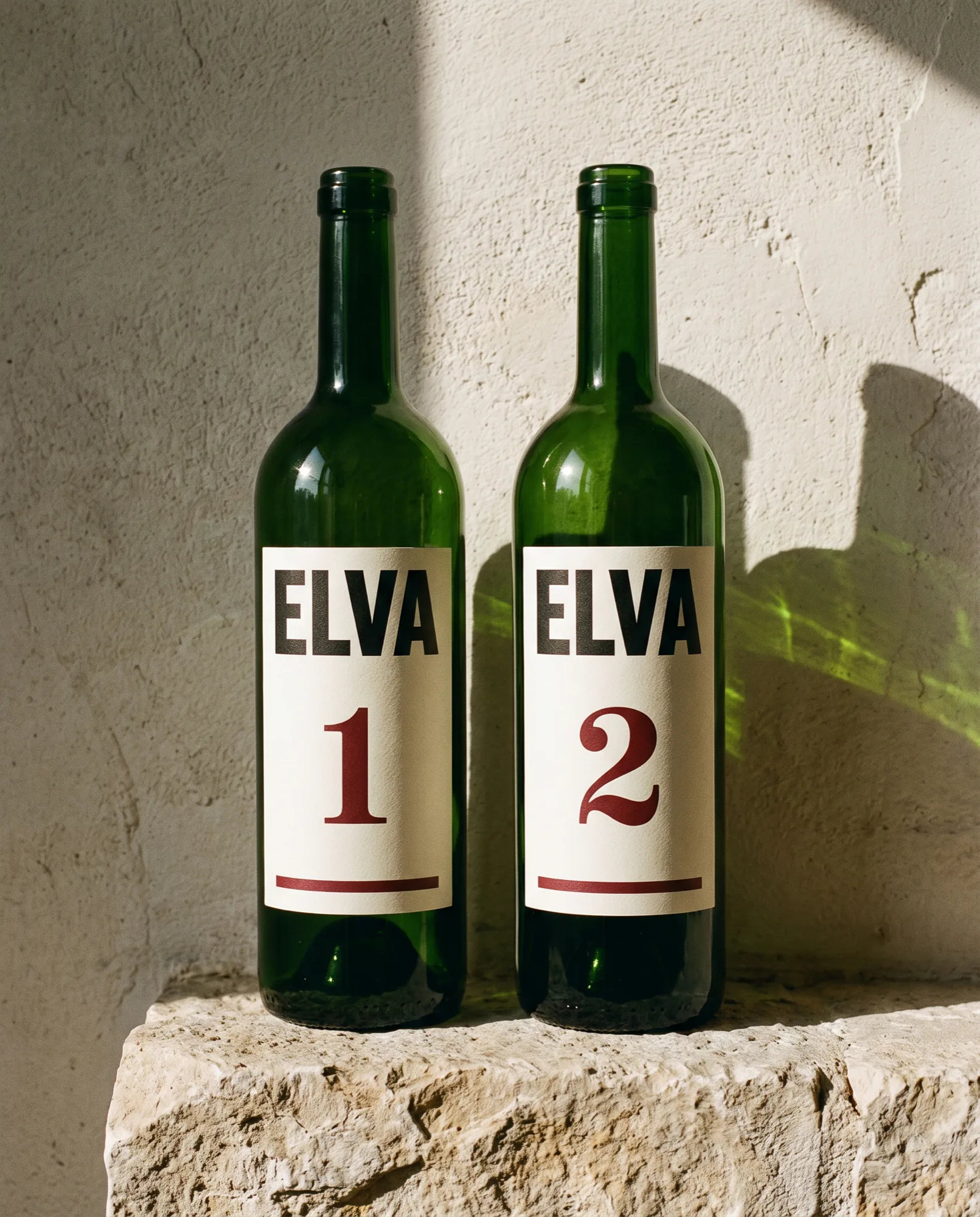
One vintage numeral doing the work of an entire back label.
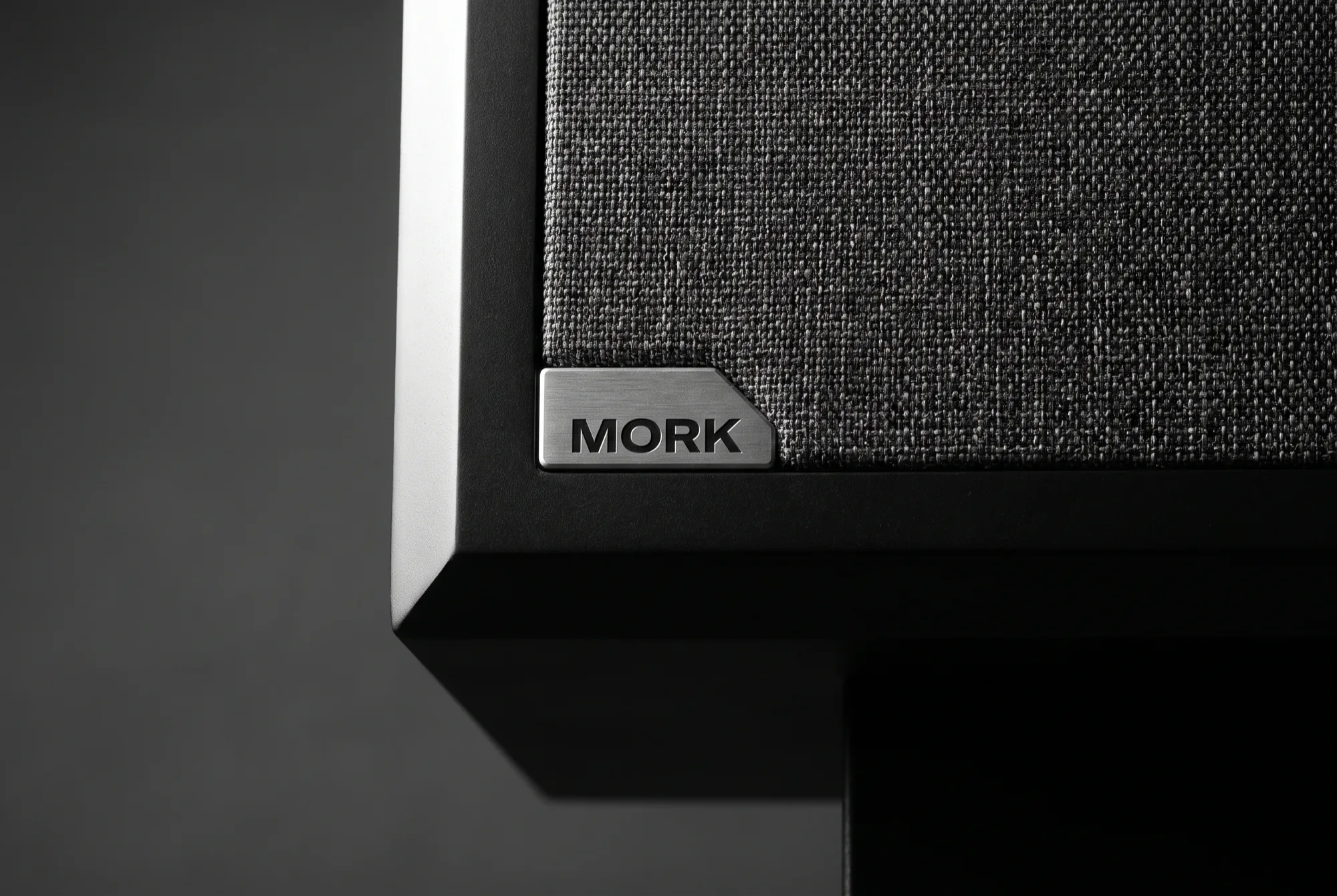
A machined badge, a control app, and not one LED in the system.
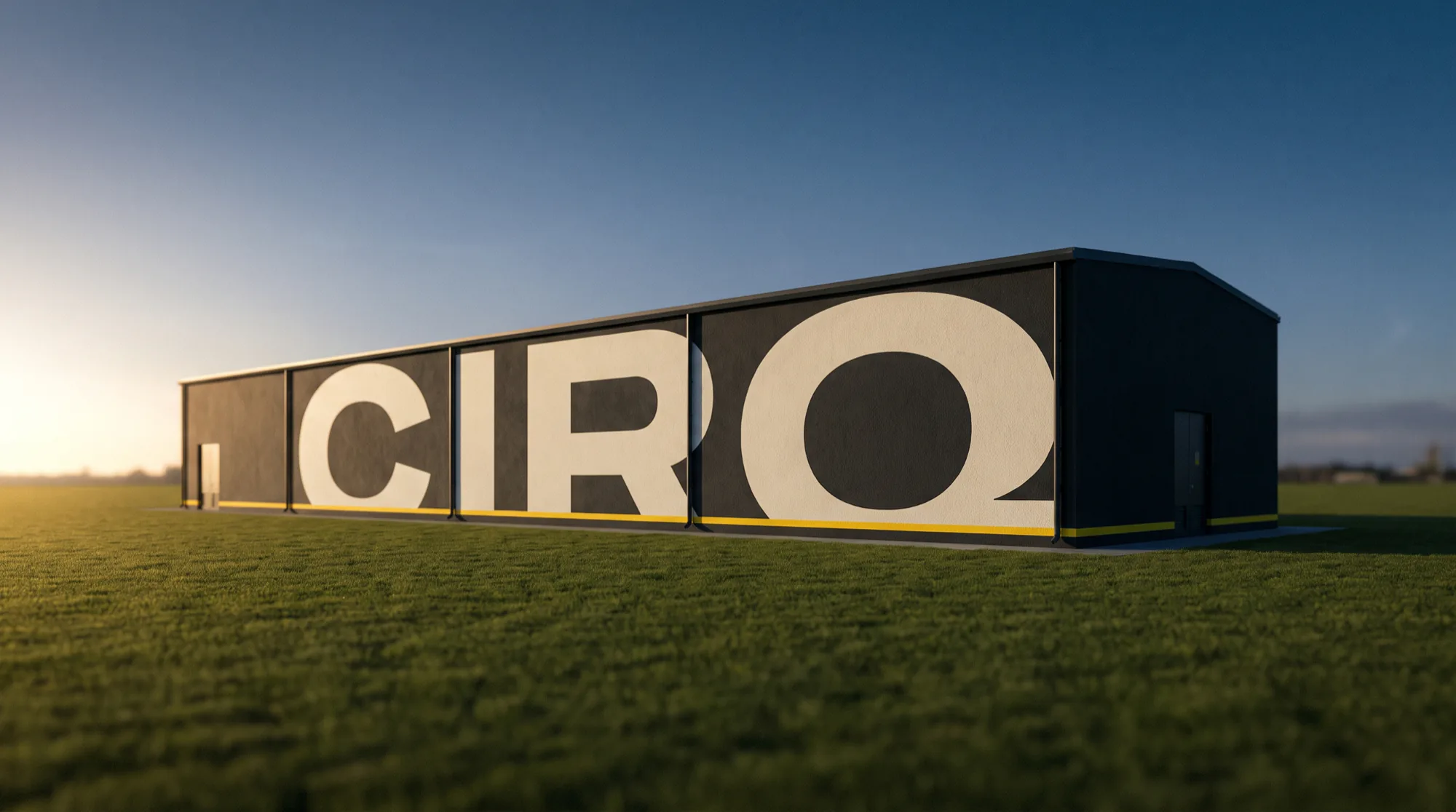
Infrastructure branded to be trusted rather than admired.

























































New projects, collaborations and partnerships. We read every brief ourselves and answer within two working days.