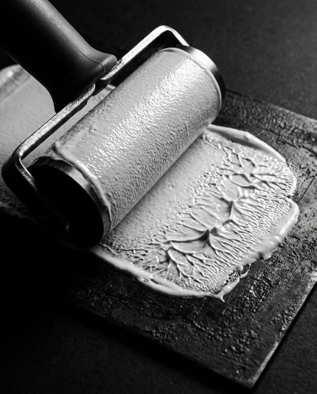

Hand painted shop lettering still beats most brand typography.
Lettering drawn at the size it would be read, by someone standing in front of the building, beats most of what ships in a type system.
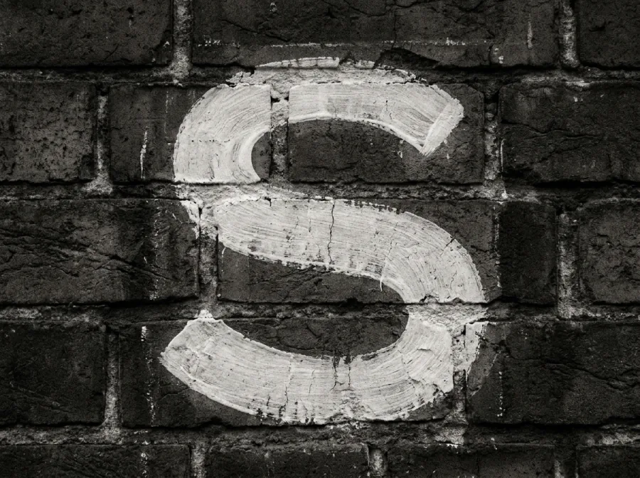
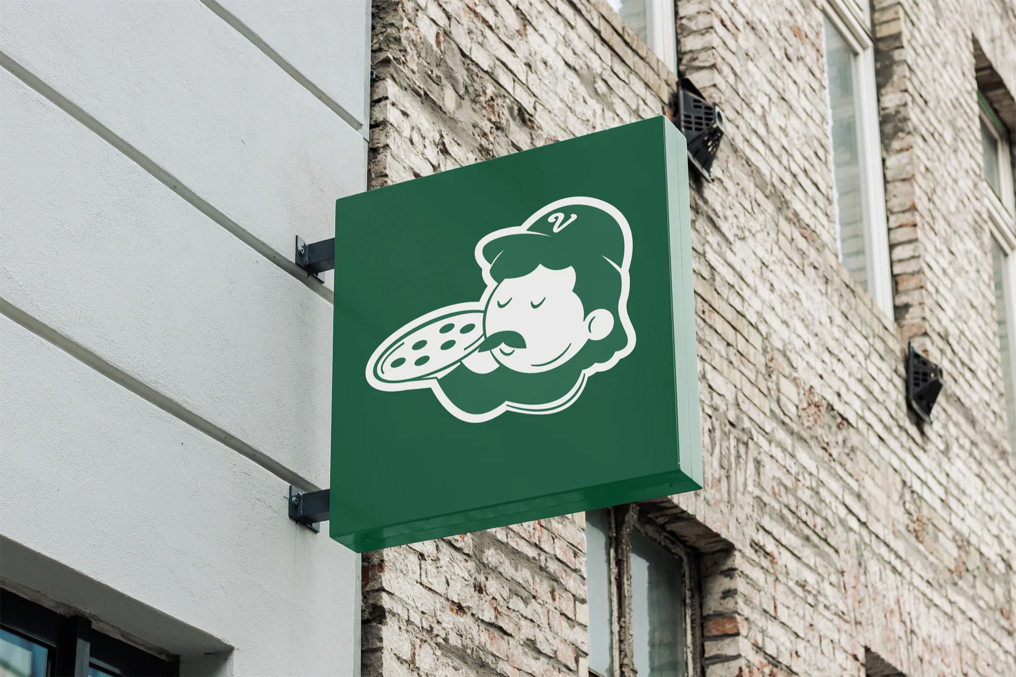
A sign painter works at final size, on the wall, in front of the building. Every decision is made against the thing the letters have to survive: the distance a person reads them from, the light at four in the afternoon, the brick they sit on.
A brand typeface is drawn at 200 points on a screen, then applied at 14. The gap between those two sizes is where most identity systems quietly fail, and it is why a shopfront painted by someone who never opened a type design tool can hold a street better than a system with nine weights.
The lesson is not to hand paint your logo. It is that type decisions made away from the place they land are guesses. Draw the small size first, on the surface it will actually appear on, and let the display size follow.
We test every identity at its worst size before its best one. A wordmark that only works at the top of a page is a presentation, not a system.